
Asteroid Mining in Soviet Style
Prompt of the Week, Russian Constructivism

This week we’re looking at how we can alter prompts when the model is struggling to recognise what we’re asking for. It can be difficult at times, particularly if (like me) you have a love for pairing up improbable subjects with opposing styles simply to see what happens, but you can generally get at least a little closer than your first attempt with a few careful interations.
To demonstrate, lets take a look at an image in the style of Russian Constructivism.
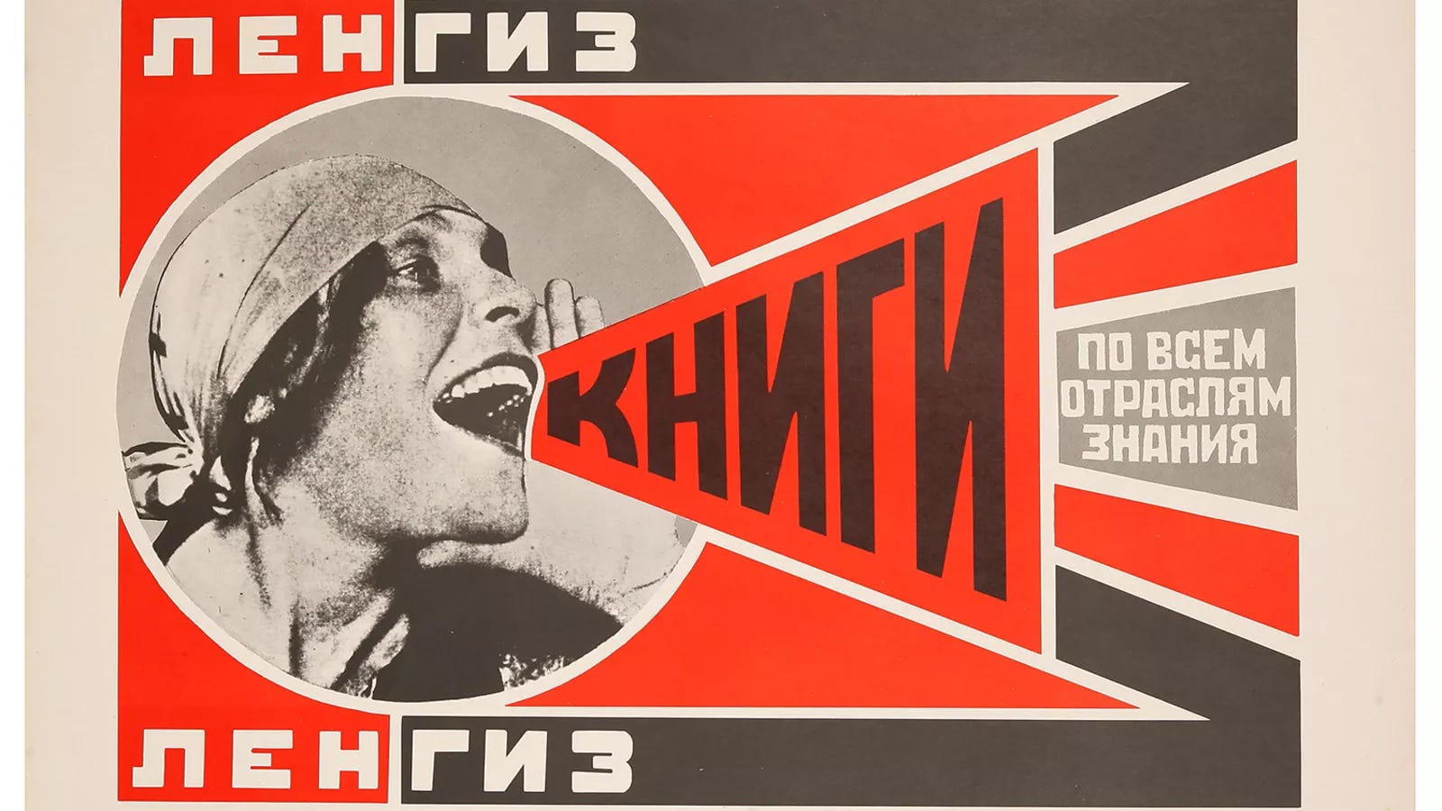
Those familiar with the style will note this image has only a little in common with standard Russian Constructivist graphic design from the early 20th century. They do have an industrial focus, a sense of hard unforgiving strength common to the soviet era and dynamic line work - however the image is much more detailed than you would expect from the simplified and abstracted constructivist styles. Traditionally constructivist images made use of a limited colour palette (generally red and black, with yellow and white as common accents), made strong use of geometric forms and simple shapes, sometimes made use of photo-montages, and made heavy use of typography as a design element. One famous example, by Russian Constructivist luminary Aleksandr Rodchenko, is below:
Lets break down our original prompt:
Key Elements
Style
“a Russian Constructivist graphic”
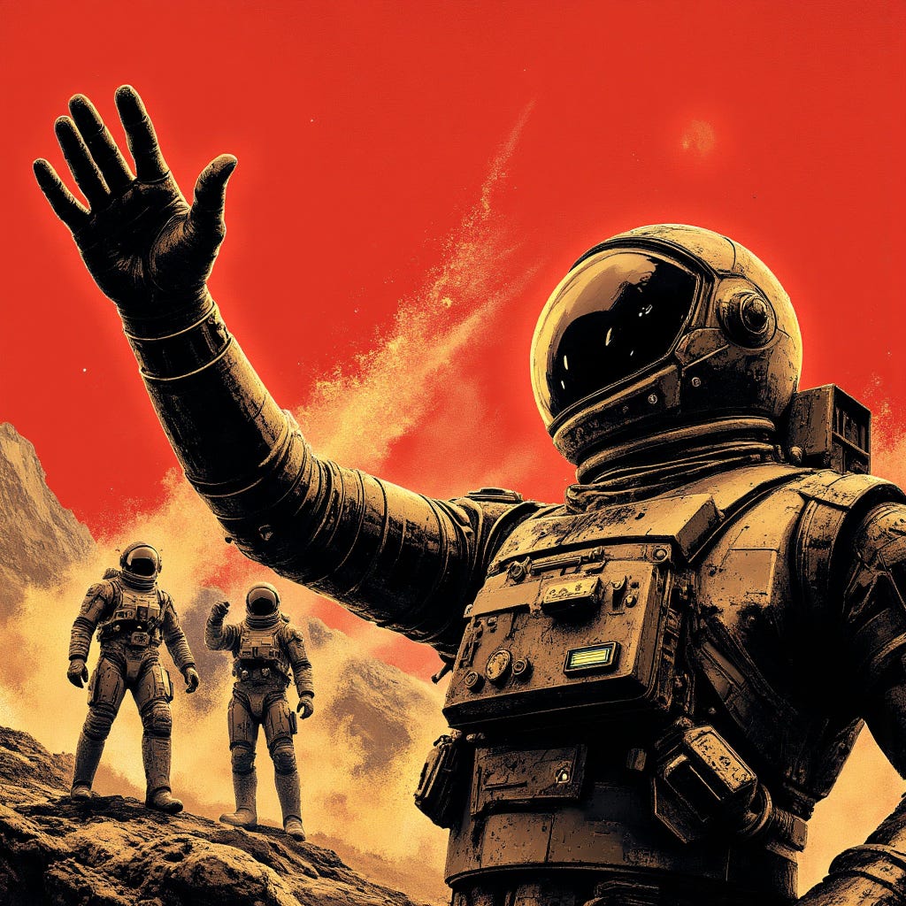
In this case it appears that a simple statement of style isn’t enough to overrule the built in desire of the model to lean towards realism for this subject, leading to the “old-school sci-fi book cover” look of the original images. They’re quite attractive images, but not particularly constructivist.
Subject
“of a powerful mining operation on an asteroid, with bold, dynamic lines depicting industrial machinery and working droids, illuminated by stark, functional floodlights”
The subject is definitely coming through in the images, we definitely get the sense of outer-space coldness and the industrial machinery pairs well with the stark, rocky landscape.
Mood
“conveying a sense of hard work and collective strength”
In Soviet Russia, Art, like most aspects of life, were subordinate to the needs of the state and served to push the image that was desired. Thus they tended to be both highly industrial (showing the way forward to prosperity), and evoked feelings of strength not only in the individual but in the collective group.
Composition
“composed in a dramatic, high-contrast, oblique angle.”
This instruction may well be at least partially responsible for the difficulty in obtaining a constructivist image, as constructivism traditionally involves flat colours without shading or perspective. The direct mention of angles here may be an issue.
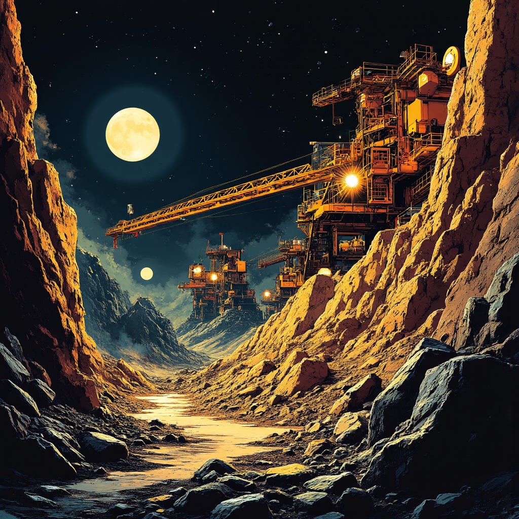
Putting it together, our initial generation run looked like this:


Produce a Russian Constructivist graphic of a powerful mining operation on an asteroid, with bold, dynamic lines depicting industrial machinery and working droids, illuminated by stark, functional floodlights, conveying a sense of hard work and collective strength, composed in a dramatic, high-contrast, oblique angle.
I really quite like these images, I am a huge fan of the retro science-fiction look that the model achieves with this prompt: but there’s no getting away from the fact that it’s not what we would be expecting given the style requested. Lets see if we can do better.
Reinforcing Style Components
The first step is to identify the specific style elements that are missing that we would expect to see in a constructivist image and update the prompt to capture this. Here is a first attempt:
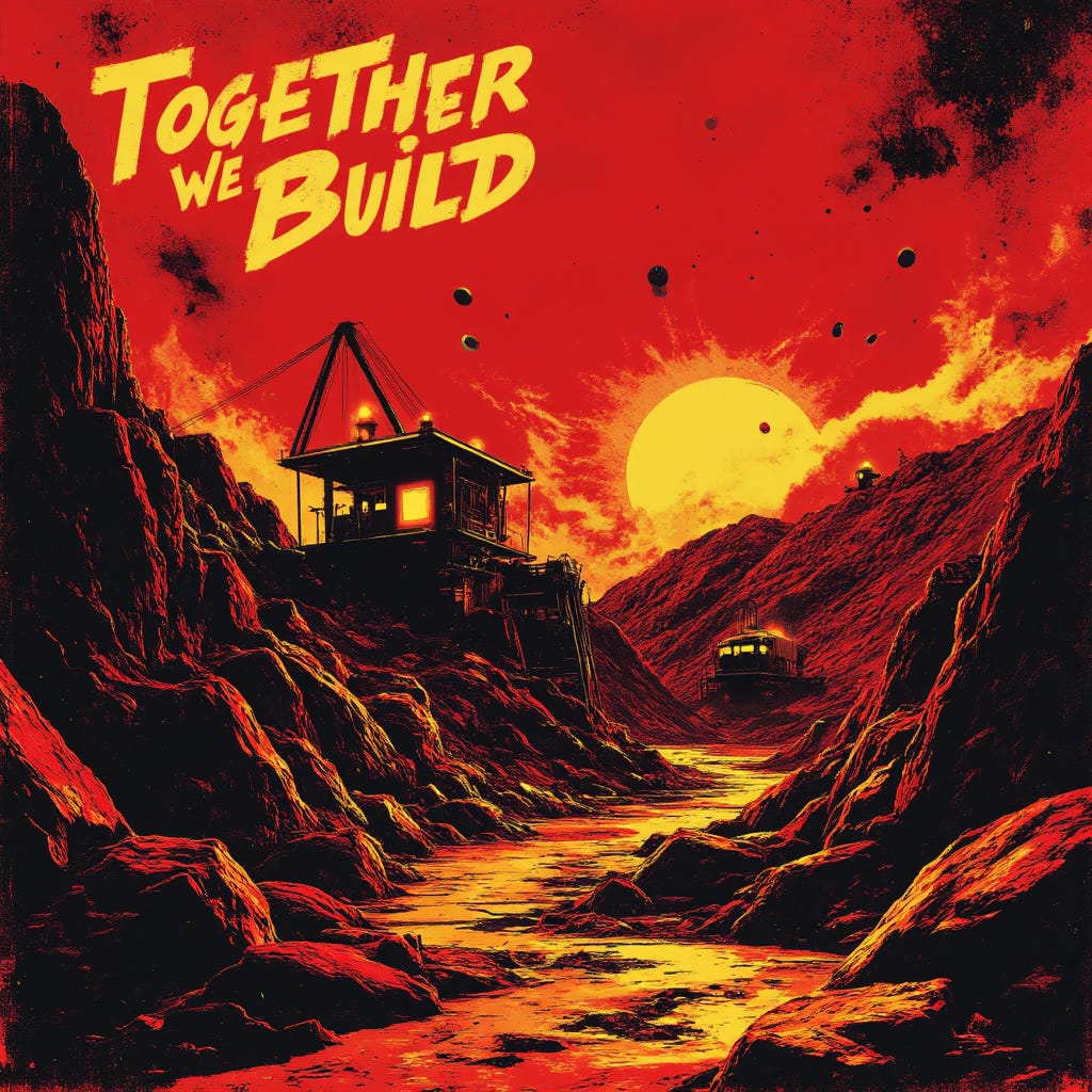
Produce a Russian Constructivist graphic of a powerful mining operation on an asteroid. Use a limited colour palette of red and black with accents in yellow, and render the scene with geometric abstractions, with bold, dynamic lines depicting industrial machinery and working droids, illuminated by stark, functional floodlights, conveying a sense of hard work and collective strength, composed in a dramatic, high-contrast, oblique angle. Incorporate into the design a typographic slogan stating, “Together, We Build.”
We’ve gotten a little closer with the addition of a slogan and limited colour palette. The model is still using complex organic forms rather than abstracting to geometric shapes as we would expect in a standard constructivist image so there is likely further to go. Still, this is a striking image.
Iterative Reinforcement, Take 2
We’re going to get a bit stronger on the wording this time, trying to push it in the direction we want it to go: flatter perspective, more of an abstract geometrical design etc.
Produce a Russian Constructivist graphic of a powerful mining operation on an asteroid. Use a limited colour palette of red and black, with accents in yellow, and render the scene with geometric abstractions and photomontage elements, with an emphasis on flat, two-dimensional shapes and bold, dynamic lines depicting industrial machinery and working droids, illuminated by stark, functional floodlights, conveying a sense of hard work and collective strength, composed in a dramatic, high-contrast, oblique angle. Incorporate into the design a typographic slogan stating, "Together, We Build."
Closer, we’re seeing more flat-colour imagery in this image though the surface of the asteroid is still rendered extremely organically. It might be that the combination of style and subject might be a step too far for the model, still there are tweaks we can continue to try.
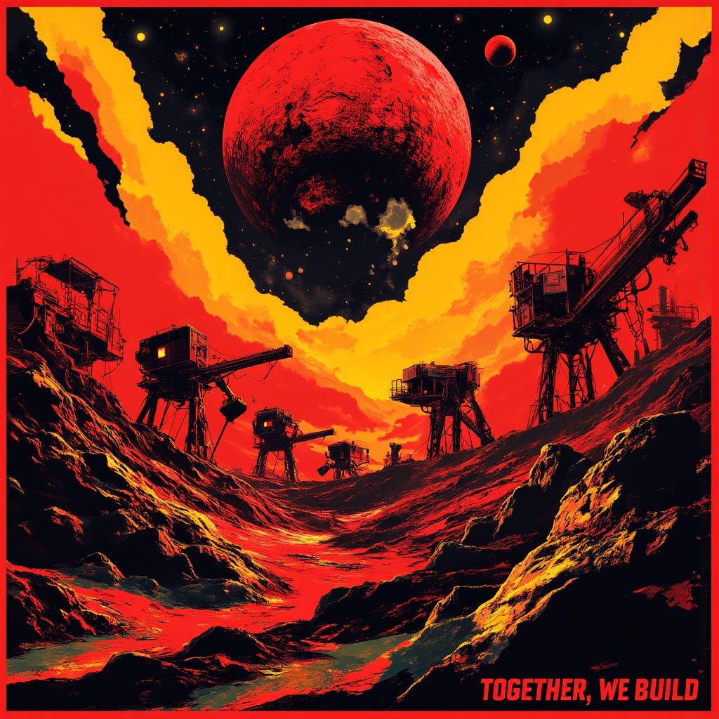
Pushing The Point


Produce a Russian Constructivist graphic of a powerful mining operation on an asteroid. Use a limited colour palette of red and black, with accents in yellow, and render the scene with
geometric abstractions andphotomontage elements and simplified geometric forms like square, rectangles, triangles and circles inwith an emphases on flat, two-dimensional shapes andbold, dynamic lines depicting industrial machinery and working droids, illuminated by stark, functional floodlights and conveying a sense of hard work and collective strength reminiscent of a soviet-era agitprop poster. Break down complex shapes into their basic geometric components and emphasise a flat, two-dimensional composition minimising the illusion of depth and perspective.composed in a dramatic, high-contrast, oblique angle.Incorporate into the design a typographic slogan stating, "Together, We Build."
The model is producing beautiful images, quite close to what we asked for. The giant machine in the sky is particularly harrowing. We’re much flatter and more graphic now but there is still considerable shading and organic forms on the landscape. Lets try once more to specifically cut down these elements.
One Last Request
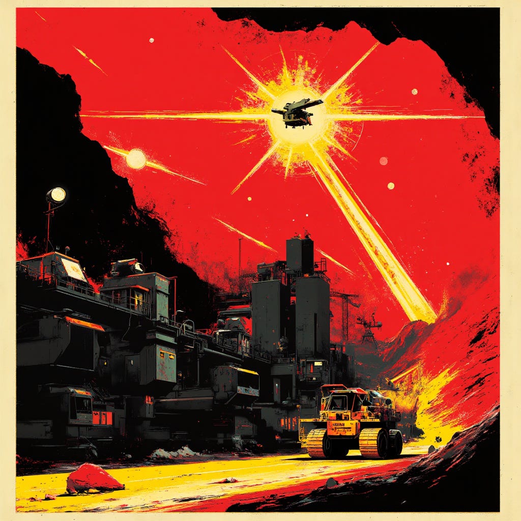
Produce a Russian Constructivist graphic of a powerful mining operation on an asteroid. Use a limited colour palette of red and black, with accents in yellow, and render the scene with photomontage elements and simplified geometric forms like square, rectangles, triangles and circles in bold, dynamic lines depicting industrial machinery and working droids, illuminated by stark, functional floodlights and conveying the sense of hard work and collective strength reminiscent of a soviet-era agitprop poster. Break down complex shapes into their basic geometric components and emphasise a flat, two-dimensional composition minimising the illusion of depth and perspective. Avoid organic shapes and shading, relying on flat colours and geometric forms. Incorporate into the design a typographic slogan stating, "Together, We Build."
This seems likely as close as we’re going to get with this combination of subject and style; we’ve managed to get significantly closer to the constructivist style but Flux.1 D does not want to be coerced into a more abstract representation with mere prompting.
We could likely get closer with more advanced techniques, using inpainting perhaps, or by fine-tuning the model on a corpus of Russian constructivist imagery: it’s certainly possible that the initial training data may have been lacking in early 20th century Russian agitprop imagery and perhaps we could get closer with a little finetuning.
Regardless, this is where we’ll leave it for another week. I hope you’ve enjoyed this walk through prompt tweaking.
Next Steps
Your turn! Take this prompt, tinker with it, experiment, and see what you can create on your own.
If you enjoy the prompt, hit me up on social media with a picture of what you’ve created, I’d love to see it. Post to Instagram or Bluesky with #HTCWeeklyPrompt and tag me directly, @hightechcreative on Instagram or @hightechcreative.bsky.social on Bluesky.
I’d especially love to see if anyone manages to get closer to true Russian constructivism with their prompts.
See you next time!
A brief reminder that The High-Tech Creative is an independent arts and technology journalism and research venture entirely supported by readers like you. The most important assistance you can provide is to recommend us to your friends and help spread the word. If you enjoy our work however and wish to support it continuing (and expanding) more directly, please click through below. For the price of a cup of coffee, you can help a great deal.
About Us
The High-Tech Creative
Your guide to AI's creative revolution and enduring artistic traditions
Publisher & Editor-in-chief: Nick Bronson
Fashion Correspondent: Trixie Bronson
AI Contributing Editor and Poetess-in-residence: Amy
If you have enjoyed our work here at The High-Tech Creative and have found it useful, please consider supporting us by sharing our publication with your friends, or click below to donate and become one of the patrons keeping us going.