


The Aesthetics of AI
How Different Models Create Unique Visual Styles

AI Art is no longer just a novelty, it is a vibrant and growing art movement that has aroused both excitement and anger in equal measure. A lot of discussions however treat “AI generated art” as a sort of universal singular. It’s not unusual to hear something along the lines of “AI Art has no soul, no human emotion to it.”
Leaving aside whether there’s any validity to that particular claim (guessing my position on that is left as an entry-level exercise for the reader), implied by the claim and others like it is the idea that AI Art is just one thing. There are a plethora of models generating AI Art and whilst they do share similarities, they can also feel quite different. Certainly their marketing would claim that each stands above the others.
So that is the question we’ll be addressing today. How much difference is there really between generative art models? Are all art models created equal? Join me as we run some experiments and find out!
Before we begin, a reminder that The High-Tech Creative is an independent arts and technology journalism and research venture entirely supported by readers like you. The most important assistance you can provide is to recommend us to your friends and help spread the word. If you enjoy our work however and wish to support it continuing (and expanding) more directly, please click through below.
Biological Analogues
Working with text-generating AIs at length and combining them with character-card personalities, I’ve come to think of models as an analogue for a physical brain. The structures laid upon it set both the deep-structure knowledge, memories and bias's of the AI. A personality card laid across the top then can be thought of like a simplified version of “life experience”. It is the nature/nuture debate written in tech - the model lays out the “biological” structure of what is possible and the personality alters how it presents to the user.
It’s something of a clumsy analogy but it works. Character card personalities can significantly change the presentation and behaviour of an AI despite the model remaining fixed, but each personality also manifests with both subtle and sometimes extreme differences depending on the model underlying it. It takes both to create the overall system.
An art model, by contrast, has only one of these two components by default. Despite being restricted to whatever emergenet “personality” arises from its base training however, every model has been through its own seperate training method and possesses its own, slightly different architectures. This has been reinforced even further with the release of the new Stable Diffusion and Flux models which have moved from the original architecture to a transformer based on much more similar to those used by leading text generation models.
It would be fair to assume then that each model would output slightly differently. As training datasets and model architectures are different and usually kept secret, we would expect the same prompt to be interpreted differently by each model. To test this, we’ve devised a series of prompts we’re going to run against a series of models, head to head, to try and determine whether models have an internal “aesthetic” of their own. A set of prompts that should allow us to see where the models own internal bias’ alter its understanding of what is being requested by the user - and more interestingly, where they coincide as well.
On Bias and Aesthetic Sense
This experiment will be unusual in that we will not be looking for the same sort of results from the models that we might usually be judging them on in a regular “head to head” comparison.
There is a lot of discussion regarding bias in AI models, usually discussing methods to reduce or eliminate it as in most cases. When AI is judging credit scores or resumes bias isn’t just unwanted it can be dangerous, potentially life destroying.
In Art models however I would argue that bias is not only desirable, it’s necessary. When we ask the question, “does a model have an aesthetic preference” we are asking, in effect, if the model is biased in particular ways. That’s what a preference is, after all, a bias towards something.
Completely unbiased, an AI model will likely be a versatile tool but a fairly sterile one. This may be exactly what is needed in some situations and we may see models like that in the future, particularly as our ability to control the output increases. A model with bias however is one that will necessarily be more interesting, bringing its own preferences to bear on the instructions it is given. This could be the difference between AI as paintbrush, or AI as artistic collaborator.
Ask Boris Vallejo to paint you a beautiful woman and you will likely receive a stunning painting of an incredibly muscular female body-builder type. A very different response than you would get should you make the same request of Rubens. We should expect the same from our art models.
This is a tightrope to walk however. Too much bias and we risk lock-in. A convergence of preferences towards a single image, which is potentially worse than too little bias. It reduces the ability of the model to produce diverse images and thus its utility for tasks beyond its obsessive speciality. This happens in humans as well; I know an artist who has spent decades painting the same painting over and over again obsessively. A bias so strong might be interesting from a psychological point of view but AI models are designed to be collaborators, and other artists wont exactly line up to collaborate in those circumstances.
A Quick Glossary
Closed Source Model: A model whose entire architecture and implementation is a proprietary secret. ChatGPT, Claude, Gemini and Grok are all closed source models, as are their image equivalents DALL-E, Midjourney and Leonardo Phoenix.
Open-Weight Models: Models where at minimum the weight files that make up the “brain” of the model are openly available to home users. Meta’s LLama models, Stable Diffusion and Flux are all examples of Open-Weight models.
Cloud-based models: Those available via API or website for a subscription fee. This includes OpenAI’s DALL-E, Midjourney, Leonardo.ai and others.
Local models: Open-weight models available for download to be run by the user on hardware. Note, open-weight models can also be available on cloud services.
LORA: A seperate smaller weights file that was trained with a specific model in order to perform a modification to that model. Often used in the community to improve perceived faults or weaknesses in a model, to add support for niche topics or styles, or to enable a model to reliably produce consistent named characters.
Fine-tunes: An open-weight model that has been subjected to additional training by the user community after release, modifying its outputs, adding or modifying features. Fine-tunes result in a completely changed model weights file and generally contain broader changes than Loras.
The Models
Unfortunately given the number of images I was going to need to generate, most of the cloud-based services were unable to be tested for this article. The free plans generally restrict generation enough that it would be weeks if not months before I would be able to generate enough images to run the experiment, and I am the impatient sort. Sadly thus, Midjourney, DALL-E and Leonardo will not be joining the roster of models tested.
Imagen 3 (via Google ImageFX) and Project Recraft both offered enough generation for a free account to be included however, and I was impressed by the quality both were able to provide on what were quite simple instructions. The rest of the models tested were those that could be run locally, both baseline models and some fine-tunes, giving us the ability to see if post-release finetune training significantly alters the aesthetic of the underlying art model.
The full list of models tested:
SDXL (base model)
Juggernaught XI (SDXL finetune)
Dreamshaper XL (SDXL finetune)
Stable Diffusion 3.5 Large
Recraft
Imagen 3
Flux.1 Dev (Base model)
Pixelwave (Flux.1 Dev finetune)
The Experiment
In order to probe for the defining aesthetic of the underlying models I decided to keep the prompts very simple to give the models the most freedom to express their underlying bias while still providing some guidance in order to produce something suitable for comparison. I decided to break the testing into two parts: Style and Substance.
The style section will feature very simple prompts requesting a style and a subject but giving no further information. Disregarding all the advice I gave in my earlier article on prompting, we provide no environment data, no lighting or mood, just a simple subject and the style to render it in. This will give us a chance to compare and see if there are significant differences between how each model is able to render the style in question.
The substance section will forgo all style information altogether and just provide a simple subject to the model. This provides the model with a huge amount of creative freedom and gives it very little to guide the sort of image to create; just the subject. This alone is enough to provide significant bias from input - certain subjects are overwhelmingly more likely to be presented in certain styes, but it should also provide us with some interesting insight into what the model thinks about those subjects in the images generated.
The Prompts
In order to guide this experiment we needed some simple but interesting prompts. Even though the first set of prompts were focused primarily on comparing styles, the differences in how they interpret subjects is interesting to see as well. For this reason we use a small grouping of popular generative art styles and two subjects for each style: one that would be a common use of that style and likely represented in the training data many times over, and one that is likely far less commonly represented in the requested style and so had more chance of being a “zero-shot” or “few-shot” request of the model.
The substance section, pared down to what is a near minimal example of what a prompt can consist of, consisted of fairly simple subject prompts designed to test a potential range of styles depending on the model’s preferences.
Style
A high-resolution photograph of a sunset over a waterfall.
A high-resolution photograph of a griffon.
Bokeh Photography of a golf ball lying amongst tall grass.
Bokeh Photography of a tiny fairy, armed for battle.
An impressionist oil painting of a medieval market day.
An impressionist oil painting of the control room of an interstellar star ship.
A picture of students walking to school in an anime style.
A picture of a man riding a buffalo in an anime style.
Substance
Beautiful woman
Handsome man
Downtown Tokyo
A space station orbitting a jungle planet
Bart Simpson
These are the prompts we shall explore with each model to determine if models have their own, internal aesthetic sense. Note the spelling mistake in the prompt “orbitting”; I didn’t notice this until I had already run generations with several models so decided to leave it in as an additional check on how the models interpreted it. On the whole, AI models seem fairly good at understanding minor typos so I didn’t expect a huge difference.
Aspect Ratio
One final note before we begin. A third aspect that has a huge effect on generated output after prompt and model is the aspect ratio used. Certain aspect ratios seem to lead the model towards certain types of image - Widescreen ratios tend to lead to more cinematic landscape style imagery, tall thin ratios lend themselves to close full-body portraits, etc.
This might be worth following up on in future but to simplify an already complicated set of tests I decided to control for this by restricting all generations to a basic 1:1 aspect ratio. A simple square.
Step One: Styles
Prompt One
A high-resolution photograph of a sunset over a waterfall.
This set of photos was quite interesting in the elements that were repeated across all the models. If you consider that the models have been trained across gigantic quantities of publicly available art, we should assume that its generic bias's should lean towards the “average”, with outliers the unique sign of creativity from the models themselves, showing where their training or architecture has diverged from other models. Quite possibly then from the repeated compositional, palette and subject elements we see across all the models, we can arrive at a sort of gestalt “common unconscious” version of what everyone expects from a “photograph of a sunset over a waterfall”; a Plato’s ideal form photograph perhaps.
A more typical “landscape photograph” subject would be difficult to find. I myself have taken many photos over the years of both sunsets and waterfalls, light on water being one of my favourite visual elements of all time. Perhaps it comes from living my life on an island.
Leaving aside my biography, lets see what the models thought.
SDXL (Base Model)
Starting with the oldest models, the SDXL series, we can see that they lack a little in the detail department (particularly when compared to the newer models as we’ll see in a moment), they are still pleasant enough to see why SDXL remains in very active community use despite newer alternatives now being available.
Over the four images generated we can see a pattern in both the stylings and the compositions of the images. The preference seems to be for high angle shots looking down at the waterfall, and for a deep orange/red wash across the whole image to highlight the sunset. There is a little variation in the images (one is a front-on rather than high-angle shot for instance), but I think we get an idea of what it thinks of “photograph” from here.


Juggernaut XI (SDXL Finetune)
Juggernaut XI (11) is a community fine-tune of the SDXL model, building on years of work across the juggernaut line adding to the realism and detail the model is capable of producing. It’s one of the most popular finetunes around and still in high-use.
I was expecting a finetune of such lineage to have developed its own style however what we see here despite some better detailing and perhaps a more subtle hand on the colour palette (the sunset wash isn’t quite so overpowering, which may be a plus or a negative depending on your preference), the overall style of the base SDXL can be seen shining through quite strongly here.
Despite the lighter touch, the colour palette shown is fundamentally the same as with SDXL, a bit more vibrant on the greens and blues, but the same style, same wash. We also see the same basic composition in use here too, indicating the fine tune hasn’t changed its idea of what a “photograph of a waterfall” should look like. If anything it’s doubled down on the high-angle shot of water flowing into a river.


Dreamshaper XL (SDXL Finetune)
Dreamshaper XL is another long-lasting, well developed community fine-tune of SDXL, this one with a long pedigree having started life as an SD 1.5 model before being recreated for SDXL when the newer model came out. No sign of a Dreamshaper for 3.5 yet that I could see however.
The Dreamshaper model series are designed to “push” the images more towards fantasy and a sort of dreamy, east-Asian inspired painterly aesthetic; so I was quite surprised to find that it produced the most realistic photograph images we’d seen so far.
We still see the compositional elements from the base model shining through. We’re still talking rivers, high angle shots, but the colour palette here is more realistic, and more noticeably the scenery has changed significantly. Rather than the somewhat stylised landscape of the first two models, here we’re seeing something more detailed, rougher, and more natural looking. This could well be a river in the more wilderness areas of my own state.


Stable Diffusion 3.5 Large
Stable Diffusion 3.5 Large is the latest and greatest version of the SD series, after the disappointing sequel to SDXL that was SD3. Despite the name continuation this is a completely retrained model and it shows; absent in the images below are the compositional and colour elements we can point to as SDXL’s “understanding” of what a photograph of a waterfall should look like.
What we do see is significantly more variety. Unlike the SDXL-based images, we see multiple versions of the sunset in these photos, not just the classic “at the horizon star-pattern lens-flare” but more subtle variations such as the first one here, where the sun lurks just below the horizon and we are still surrounded by the twilight of early evening.
Both the colours and the detail are more realistic and it seems this model believes a waterfall should be shot either face on or at a slight low angle, rather than the high angle preferred by SDXL. What is interesting though is that despite the additional detail, we are still seeing that stylised, fairly barren landscape that was on show in SDXL. It’s not quite as stark, but I still find myself preferring Dreamshaper’s interpretation. There’s no denying that the rest of the details are far better though, from the addition of further small waterfall streams to the much better rendering of the mist-spray, SD 3.5 is an impressive model. Should enough of the community forgive them for the debacle that was SD 3 and start showing the model the sort of love that SDXL received, we could expect big things from community finetunes.


Recraft
We leave Stable Diffusion behind now and turn to the first of the cloud models. The model itself used by Recraft isn’t specified leading many to assume, like some of the other providers, that they have their own proprietary model. (Most open models require attribution and licensing to run as a service).
We can see some definite changes from the standard elements we saw in the previous models though one in particular is apparently popular enough to cross systems - the high angle composition shot.
We do see significantly more variety here than in the SDXL images however, with several other compositions shown (A low-angle and direct-shot) and, interesting, a more varied landscape that we have seen in the other models. Where as SDXL and SD3.5 both leaned towards fairly stylised, stark green - and one of the images given us by Recraft fits that bill - We also see two significantly more detailed greenery filled examples and the one selected below, a very different dirt-and-stone landscape that reminds me somewhat of old mineworking left over from a strip mining operation. It’s stark, lonely, and very different to the others.
We’re also seeing significantly better realism than any of the others so far, including 3.5. Remember that we asked only for a “high-resolution photograph” - not necessarily a realistic one, leaving the idea of how realistic to be up to the bias of the model. I’ve noticed a definite bias towards realism in many of the cloud models (Midjourney being the notable exception).
We do see a repeated colour palette and the same style of dramatic sky across all four pictures, suggesting that these elements form a core part of the prompt; likely what the model considers to be a “sunset” photograph.
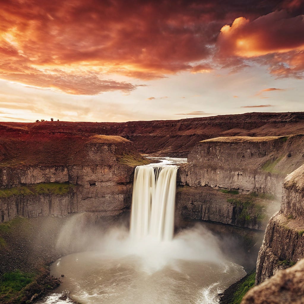


Imagen 3
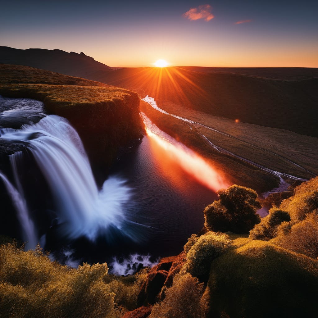
Google’s “Imagen 3” model can produce some absolutely beautiful photos and that’s what we see on display here. Whilst we’d likely need to go through many more generations to be sure, with our limited test range here it looks like Imagen is deciding between two different types of waterfall to give us. The first, highlighted below, shares a lot of common elements with what we’ve seen so far. High angle shot, fairly narrow waterfall, river flow in and out of the falls. Here the rock detail is much better than we’ve seen earlier and the landscape itself is more rocky, scrubby. This looks like a high altitude location, or perhaps a high latitude one.
The final image of the set looks very similar though with a landscape more similar to what we saw from SD 3.5. Green but fairly sparse. The water looks more “streamy”, slightly stylised or at least from a fairly obstacle free waterfall. The first one here however is a beautiful representation of a white-water fall, showing layers of pace change as the water pounds through the rocky obstacles at the top of the falls.
The middle two images are of a different sort of waterfall - a much bigger, wider though shorter falls. The variety is interesting and speaks to a wider range of training perhaps for Imagen. For the first time we see significant changes in colour palette too; though all the pictures share a penchant for dramatic skies, we have two different palettes in use here - a softer evening orange the sort we’ve seen in the previous images and a much more vivid and dramatic red and blue sunset.
It definitely feels like Imagen is drawing from a deeper toolkit of elements when deciding what a “photograph of a sunset waterfall” looks like than the other models.


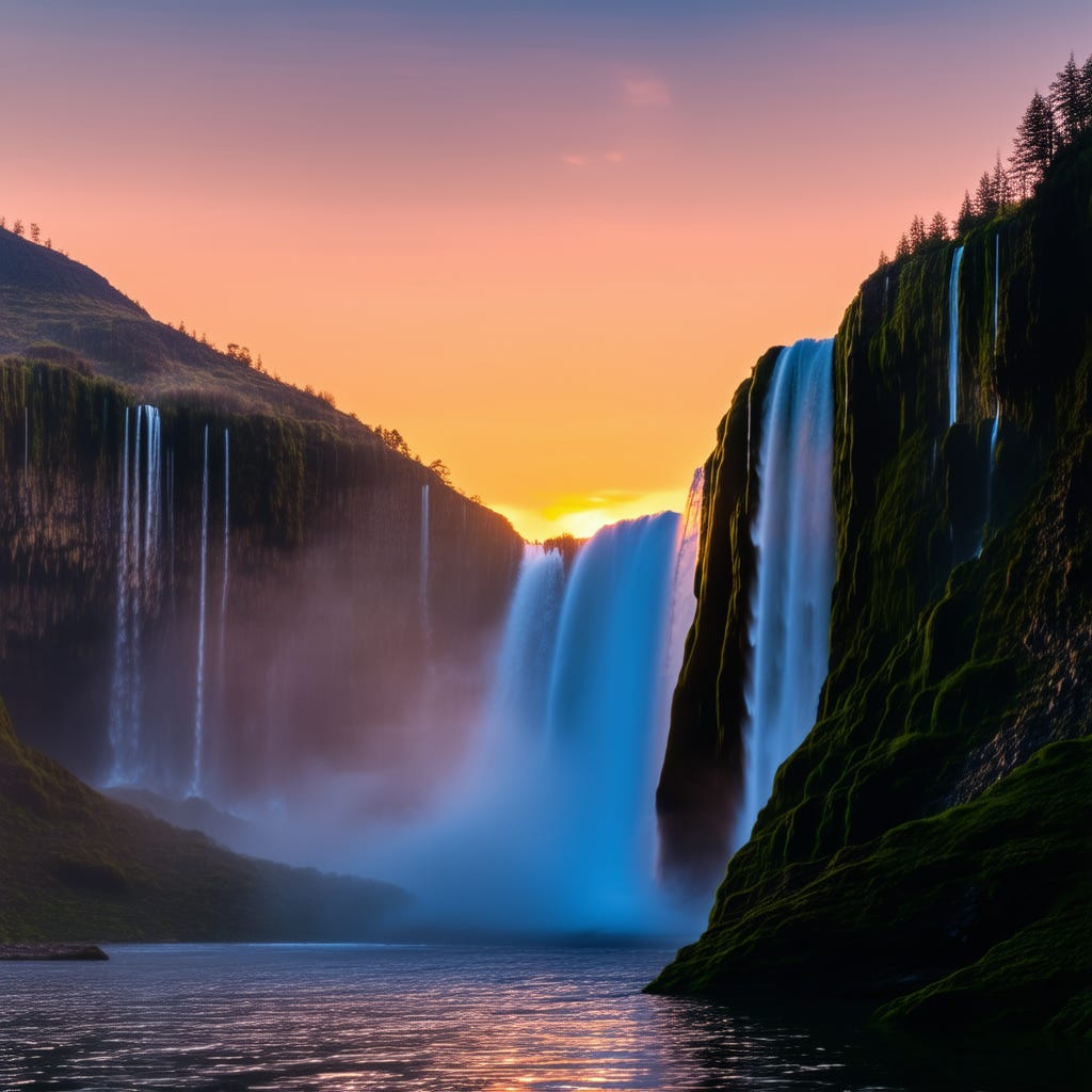
Flux.1 D
Flux.1 Dev is the new darling of the open-weights community and it makes a fairly impressive initial entry to our little experiment here. Immediately, like with Imagen, we see a wider variety shown amongst the four images; we have two different sorts of waterfall, two primary colour palettes and two types of sunset sky. It shares a fair bit in common with Imagen but doesn’t have quite the same level of realism in the landscape though I think its variety outshines even Imagen’s attempt - the last image in the series in particular is a very different landscape than any we’ve seen presented so far.
There is one constant across the images, most obvious in the latter three which makes sense in terms of physical properties. Flux is rendering the mist from the falls remarkably well in those images. We mentioned the mist and spray while looking at the Recraft images, but none of those images do it as well as Flux does here. The second image in particular; you can really feel the speed and violence of those falls throwing up so much spray and mist, and the rendering shows real volume. You can almost hear the pounding of the water against the rocks below. These are some of my favourite of this set.


Pixelwave (Flux.1 D Finetune)
Pixelwave is a community finetune of Flux.1 D and, like Dreamshaper earlier, quite a surprise. Unlike Dreamshaper the intention with this tune is not to introduce a specific bias but to generally expand Flux’s repetoire in all areas, “art styles, photography and anime” according to the creator.
If you look at the images below however, you’ll see a first and only for this set. It’s present in all of the images but most noticeable in the one I selected for full size.
It’s a beautiful picture, but it doesn’t have the same realism as even the SDXL fine tunes. It looks a bit washed out, a bit stylised. In fact if you look closely…
It’s a painting. Pixelwave was the only model who took our prompt, which requested a photograph, and decided the lack of “realistic” or other modifier afforded it the creative space to do what it wanted to do; and apparently this model wants to paint. The composition elements and colour palettes of the base model still shine through, particularly with those wide canyon waterfalls and the variations between a dramatic orange and a more serene blue sunset. The styling though is completely unique, across all the other model generations, showing that a finetune can diverge quite significantly from its base on an aesthetic level.


Prompt Two
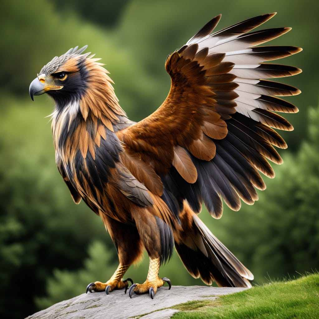
A high-resolution photograph of a griffon.
If the first prompt was designed as a “archetypical landscape photo”, this prompt was intended to be the opposite - a photograph of a mythical creature that doesn’t actually exist.
Which proved to be a stumbling block as out of all the models tested only one demonstrated knowledge of what a griffon was enough to actually provide us with a photo of one. All of the others failed and mostly in exactly the same way, which is itself interesting. The way they failed suggests a partial but not complete understanding of a griffon, and the fact they all failed in that way suggests some similarity in training is the root cause of it. I noticed previously that Flux.1 D was unable or unwilling to produce a Satyr for me, so perhaps we have a huge blind spot in these models when it comes to classical mythology? If so, that could be an excellent potential future project for us.
SDXL (Base Model)
SDXL continues from its first prompt with a fairly good rendition of a realistic photograph, though it is stylised enough that it would be unlikely ever to be mistaken for a real one.
We see here the motif that will be repeated across most of the models - whilst we do not get a griffon, we do get an eagle. I had to go an check and make sure I hadn’t made a mistake, and there wasn’t an eagle called a “griffon” but no. There is a griffon buzzard, but it’s a rarely used name for the bird and it looks nothing at all like an eagle, which these certainly are.
This is interesting in and of itself. A Griffon is a mythological creature that is half eagle, half lion, and the fact that all of the models produce an eagle suggests that at least some of that knowledge has percolated into the model somehow.
We see a variety here in the landscape, and the types of eagles portrayed, though a definite pattern in the composition - all of them showing a side view of the bird perched or, in the case of this first one, landing. It’s hard to draw too many conclusions from the variety shown in landscape and colour as it could as easily be a sign of the model’s confusion as its underlying aesthetic.


Juggernaut XI (SDXL Finetune)
Juggernaut gives us some interesting clues as to part of what might be happening with this prompt. We can see the core elements of SDXL shining through as we did with the first prompt, with some added realism except for the pose of the eagle. As demonstrated by the first and second images, that’s quite a strange and unnatural pose for an eagle. The third isn’t much better, except that they are quite natural in a different context.
Eagles in heraldry are posed exactly like this, generally in one of two ways. Posed looking to one side, usually the left, with the wings coming up in a big sweep (exactly like the first picture below), or facing the viewer with both wings swept out to either side, a lot like the third picture below.
Why heraldry? Likely because other than mythology that’s the other place a Griffon is likely to show up. A griffon (or griffin) is a common heraldic animal that actually poses much like the eagle, with wings swept in an upward arc and an eagles head. The difference is the Griffon’s lion body and all four legs are also portrayed.
If I had to guess, I’d say these models have gone to heraldry for a griffon, but gotten confused and decided it was easier to render an eagle as no doubt it had already been trained on photorealistic examples of eagles.


Dreamshaper XL (SDXL Finetune)
Dreamshaper performed almost identically to its two siblings, giving us a consistent eagle complete with rampant wings from heraldry. No griffon in sight, sadly.


Stable Diffusion 3.5 Large
SD 3.5 has given us less realistic looking and more stylised eagle, though the variants are more realistic. Again the variety here across composition, backdrop and positioning speaks, I think, more to confusion within the model around the prompt than to actual aesthetics.
The model doesn’t disappoint on the realism stakes however as that last photo is quite good and quite convincing, giving us an eagle’s head in a natural “caught in the wild” pose.


Recraft
Recraft is our hero model for this round, the only one capable of giving us an actual griffon; and doing so in quite a realistic manner. We can see some evidence of confusion evident even here however - a photograph of a griffon is a strange thing to ask for and leaves itself wide open to interpretation. Did we mean a photorealistic photo of a griffon? It’s a strange ask as griffons don’t exist, but that could be what we wanted and that is what Recraft provided quite nicely in the first two images.
The second two however are revealing the ambiguity in the prompt. Instead of a photograph of a griffon, we get two very realistic photographs of statues of a griffon. If we were working on a project here we could likely refine the prompt, asking for a photorealistic image of a living griffon or something similar but in terms of this test it has performed admirably. That first image is my favourite of this run, a beautiful impossible creature.


Imagen 3
After Recraft gave us the first successful griffon you could be forgiven if, like myself, you thought perhaps our other cloud model under test might also succeed where my local models fail us. Below are Google Imagen 3’s attempts at rendering a griffon. It’s a beautiful, extremely photorealistic image.
And what exactly is that supposed to be, Google? It’s definitely not a griffon. Strange looking for an Eagle too.
Whilst it is a bird from the raptor family, what Imagen gave us was neither griffon nor eagle, that my friends is a peregrine falcon.
No, I have no idea why. It’s pretty, but not even close to what was requested.


Flux.1 D
Flux seems to have had the same trouble with the prompt as the various stable diffusion models before it though unlike Imagen it was able to at least present us with an eagle. Three different types of eagles in fact. And a drawing of an eagle. For reasons.
Some quick searching reveals those are all legitimate types of eagles and quite nicely rendered. Flux appears to have an aesthetic in mind here, rendering all three of the photograph images as close-up, bokeh photograph shots with the head of the bird in sharp focus. It’s not clear if this is what it thinks an eagle photograph should look like, a griffon photograph, or if its caught interpreting between the two, but the consistency is there enough to recognise a definite, purposeful style preference. Clean, clear lighting without any mood setting washes and a very crisp subject. If I wanted an eagle, I’d be extremely pleased.


Pixelwave (Flux.1 D Finetune)
If Imagen seemed to forget what it was doing and wander off, to come back with a photograph of a falcon, then I suspect Pixelwave may have taken to drinking. In the other three variants we can see the base model shining through consistently, reinforcing the aesthetic elements we could identify in those images - bokeh photo, close up of the head etc. I’m not sure what’s going on with this first image.
It doesn’t appear to be a real eagle. There is one that has a slight crest on its neck but nothing I could find with a full feather mohawk.
Definitely not a griffon.


Prompt Three
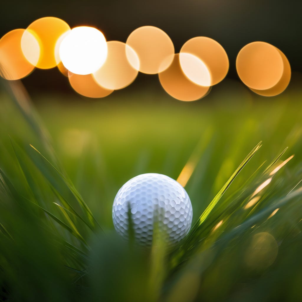
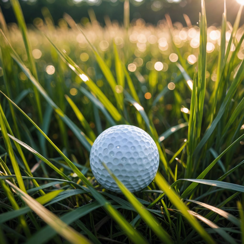
Bokeh Photography of a golf ball lying amongst tall grass.
This prompt isn’t a particularly exciting one but that’s part of what is being looked at here. Without much to go on in the prompt, not much to infer from the situation, the door is open for the models to indulge themselves. Sadly, they didn’t show much initiative here. The general cross-model consensus seems to be a remarkable lack of variety in composition, colouring, even lighting.
SDXL (Base Model)
The base SDXL model does reasonably poorly at this prompt. It’s able to give us a fairly crisp example of a golf-ball but seems to struggle a bit with the grass, or even deciding if the grass should be in focus or affected by the short depth of field. We’re left with something of a muddle, including the model choosing to insert a “tee” under the golf ball in several variations.
We do see signs of a consistent aesthetic though, despite the flaws in the implementation, the SDXL model appears to have a strong opinion around what this image should look like. The ball centered in the image, the backdrop blurred and fairly distant. Mountains in the background appear recurrent. Fairly long grass. It gives very “community golf course” vibes, with an unmanicured “rough” cradling the ball after a poor stroke.


Juggernaut XI (SDXL Finetune)
We see significant improvement in the Juggernaut finetune model over the baseline SDXL with a far better understanding of Bokeh and how the depth of field should be rendered giving us more pleasing pictures overall.
We also appear to have gotten rid of the unwanted tees in this photos too, the ball lies more naturally, still mostly centered and the grass is rendered much better. Beyond that we see the aesthetics of the base model shining through remaining consistent in the lighting, colour palette, basic scene composition, backgrounds and the golf ball itself. The finetune appears to have greatly improved SDXL’s realism and ability to render photographic effects but hasn’t done much to increase the variety of its understanding of this prompt. It’s safe to say the SDXL has a very strong locked in bias around this subject.


Dreamshaper XL (SDXL Finetune)
For this test Dreamshaper appears to be walking a line between the SDXL base model and Juggernaut. Like Juggernaut the tuning has done a great deal for SDXL’s understanding of photographic effects and given it the ability to render the grass and depth of field much better. Also like Juggernaut, the training has done little to shift its natural bias around this prompt, SDXL’s aesthetic choices around this scene remain intact and narrow.
Unlike Juggernaut however it doesn’t seem to have completely rid SDXL of its desire to insert tees into the images. Whilst the tees themselves don’t seem to appear the golf balls in two of the variants are positioned awkwardly as if sitting on one. On the whole, all three SDXL-based models show remarkably consistency across the board.


Stable Diffusion 3.5 Large
Interestingly, in terms of this scene, SD 3.5 Large seems a step back from the SDXL finetunes in terms of this prompt. Whilst the model’s understanding of photographic rendering is obviously significantly better than the base SDXL model and it shows considerably more variety in the images themselves than the remarkably locked in consistency seen in the SDXL models, the variants we get simply aren’t very pleasing. Instead of the lush, long grass of the previous models, we get spindly long grass or no long grass at all in these variants. The lighting remains similar to the SDXL models, the backgrounds are broadly similar though with more variety speaking to a bigger image vocabulary. The third image includes a strange misty overlay that feels more like a corruption or accident than an aesthetic choice.
On the whole, around this subject, the model feels muddied and confused on this prompt. Whilst variety (and avoiding lock-in) can be a great sign of a versatile and creative model, on this run it feels less like a broad idea of the prompt and more like no central idea at all.
Some consistencies do remain. Basic composition, with the ball centered in the frame, is a Bokeh staple, the lighting is broadly consistent with previous models, and though the grass in question here is a spindly looking thing, like the previous models it is a healthy green. This likely speaks to an overall trend in the zeitgeist for this kind of photo - they are mostly taken on maintained and watered golf courses.


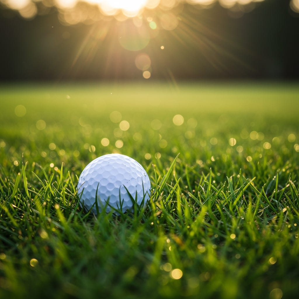
Recraft
As with previous photographic requests, Recraft does an excellent job on the realism front. Unlike the others, there is a very deeply locked in bias on this prompt that is consistent across every generation. It’s unusual for a generator, even with a much more directed prompt, to do what has been done here and give us essentially four copies of the same image, with only very minor variations.
The lighting, framing, grass type, colour palette, all identical in each image. Even the composition, golf-ball slightly off centre, position so the ground is sloping down to the right, creating a line that draws the eye. Identical in each photo (with a variant in which side the ball is offset to).
Given the creative freedom offered by the simple prompt, this is likely the strongest indication of preference a model has shown across our generations. It has a singular idea, a solid aesthetic, of what this image should look like, and this it is.
On the whole, I think it does a reasonably good job of it.


Imagen 3
Like Recraft, Imagen has a very solid idea of its preferred aesthetic and is reasonably consistent across all generations, though it’s not quite redeeming itself for the falcon with this run.
It appears to have a fairly modest idea of what constitutes “long grass”, and the fact that it remains consistent shows it’s part of this models preference for this prompt. The composition, lighting and background appears consistent not just across generations but with the earlier models too, again pointing to a solidified zeitgeist opinion around images of this type. The grass here feels like a well manicured “rough” on a golf course, as opposed to the more visually interesting and slightly more wild version offered by recraft and SDXL. Lighting is fairly consistently around sunset in all four images, with the key variant being the amount of gold washing over the image as a whole.


Flux.1 D
Though suffering, to a lesser degree, from the same opinions regarding what constitutes long grass in this context as Imagen does, Flux.1 D is offering up far more variety and visual interest. It’s the first model to try something different with the golf-ball itself. Though the colour and patterning remains the same as other models, Flux does recognise that golf-balls often have brandings and attempts some symbols in place of words, a nice touch.
The remarkable consistency across all the models talks to a solid and narrow agreement across the cultural zeitgeist as to how this sort of image should look. Even within these constraints though, Flux, like Recraft, shows signs of an independent aesthetic take on the common elements with slight variations in framing, length of focus and the surrounding grass.


Pixelwave (Flux.1 D Finetune)
We don’t see the radical departure from the base model that we saw in the first image here but we do see this fine-tune distinguishing itself from its base once again.
Whilst we do hit the general marks on these generations that we have seen in other models runs, we also have a much more casual feel to the approach here, a different style. The lighting is less pointed, we’re not stuck with a golden sunset this time but a fairly average day. Each image feels less like a posed art-photograph and more like a candid shot that just happened to be taken with a decent camera.
We see a doubling down on the variation to composition that the base model was leaning towards here, with differences to distance and even angles, yet it still maintains a sense of its own style. If none of these compositions are quite as strong as Recraft’s, it’s not locked in to just one singular idea either.


Prompt Four
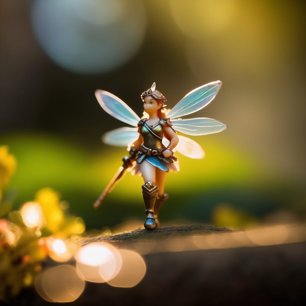
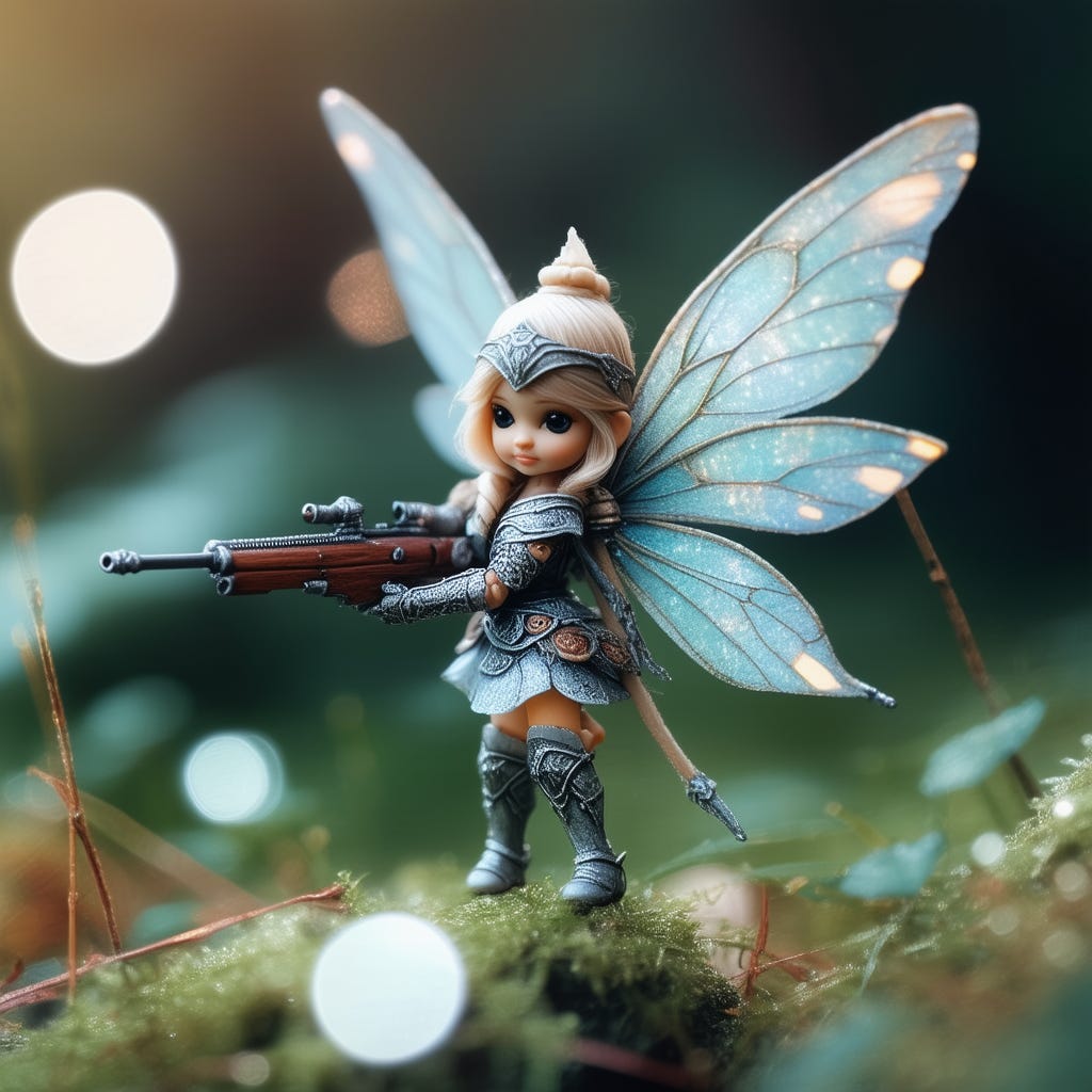
Bokeh Photography of a tiny fairy, armed for battle.
This prompt, like the Griffon, revealed an interesting consistency across all the tested models: none of them attempted to generate a photorealistic fairy. Instead they all landed on the idea of generating a photograph of a small plastic toy fairy.
It’s the convergence of decisions like this that makes it interesting. Art models are trained on hundreds of thousands, perhaps millions, of images, gathered by completely separate teams. Yet somewhere amongst all that data there was a similar thread in every one of these datasets that was strong enough to teach all of these models that the best way to render a small fairy in a photograph was with a plastic toy.
There are two subjects in this prompt however; the fairy, and the fact that the fairy is armed, which means we also get to see what each model thinks are appropriate weapons for a fairy. Stable Diffusion 3.5 may surprise you.
SDXL (Base Model)
At this stage we’re seeing enough familiar elements that we might begin to suspect that some of SDXL’s aesthetic preferences, such as for natural if somewhat overly golden sunset/sunrise lighting, are strongly set across photograph images in general.
As we saw with the golf ball generation prompt, SDXL is struggling a little with representing Bokeh photography and depth of field. What we can see here however is that it might be less the depth of field it struggles with; the ground beneath the fairy is rendered quite sharply; but more that it has an aesthetic preference for minimising detail withing the focus depth. Whilst this can make the image slightly less visually interesting, and in the golf-ball example actually muddied the image somewhat, it is an effective way to highlight the core subject.
The subject itself is being represented consistently across variants here as well with fairly human-like proportions to the body, insect-like wings and metal plate armour. SDXL prefers swords for weaponry, but does provide a bow for one variant; all appropriately stereotypical weapons for tiny fairy warriors.


Juggernaut XI (SDXL Finetune)
Juggernaut once again improves on its base models ability to render the photographic effects but interestingly leans further into the “toy” aesthetic, rendering the fairy with more exaggerated proportions to make them cuter and more childlike. The juxtaposition of the small childish smile on the fairy’s face with the very well rendered two-handed sword she is holding is quite striking. This is repeated in the variations; creating a sort of “cute psycho” effect that is fairly endearing overall.
Note however that the finetuning has also resulted in a lack of variety in the fairy subject as well. Every variant here shares the same clothing, the same face, the same red hair cut short. Convergence on a single ideal of what a fairy looks like.


Dreamshaper XL (SDXL Finetune)
Dreamshaper likewise improves on the base model’s photographic technique and makes some modifications to the style of the fairy. In this case we are again exaggerating proportions to enhance the child-like aspect but to a slightly lesser extent, retaining some of the adult proportions of the base model. We also change up the weapons a little, with one variant using what looks like a magic wand of some sort; or perhaps a mace with a crystal head, which would be pretty but I suspect less effective than traditional metals. Like Juggernaught, this finetune has significantly reduced variety in the subject as well, though Dreamshaper does give us one variant with blonde rather than red hair.
All three SDXL based models have kept the same basic lighting, colour palette and compositional styles but each differentiates themselves quite significantly in how they render the subject resulting in three quite different aesthetic styles here.
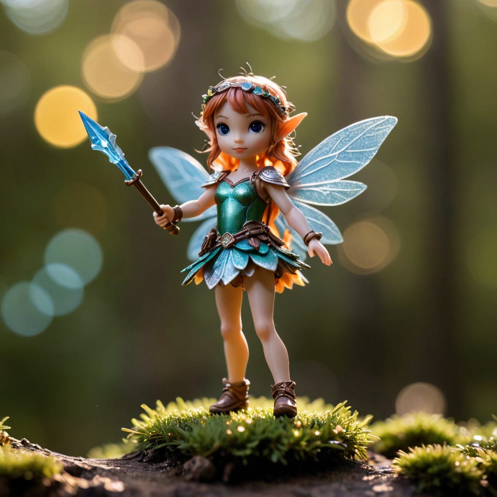


Stable Diffusion 3.5 Large
As we have seen previously, SD 3.5 is significantly better than SDXL at rendering photographic techniques and this is visible here as well. SD has, like the SDXL fine tunes, leaned in to the more exaggerated child-like look, though with slightly more variation in face, clothing and hair than seen in SDXL.
The most glaring difference here is, of course, that SD 3.5 has given its fairies guns. The model is unique in making this decision amongst the models tested in this run, and I’d be lying if I said I wasn’t quite taken by the steely look of determination on that rifle-wielding fairy’s face as she prepares to defend her homeland from the invaders.


Recraft
Recraft has embraced a more realistically proportioned toy style as well as returning to a preference for angled composition in its Bokeh photography that it displayed in the golf-ball run. The posing is more dramatic than what we have seen from other models as well, imparting a sense of movement absent from the SD models.
There’s no denying that Recraft excels at photographic images and has a very distinctive style.


Imagen 3
Imagen has, like other models, settled on a more cutesy styling for the fairies however doesn’t appear to hold the preference quite as strongly, one variant showing a significant difference in general look and feel. We also see more variation in hair styles (though limited) and colouring, as well as in the manner in which the fairies are armed and armoured. While still favouring metal plate armour and swords we get a variety of armour styles including decorative headbands and one variant armed with spear and shield. It also shows more variation in setting, opting for fields of flowers as well as the standard forest chosen by earlier models.
Imagen does appear to be taking what little context we provide in the prompt more seriously however and is the only model to decide to give us an actual opponent to fight in one of the more interesting images we’ve seen. The look of intensity on the fairy’s face as she faces her opponent is both contextually appropriate and well rendered.


Flux.1 D
Flux.1 D shows its preferences here more in terms of the technical shot than the subject, with similar composition, field of view settings, background and lighting across all variations. There are similarities in subject as well, with a preference for childlike proportions, but significantly more variation than we have seen with other models. The hair changes not only in style, but in material, from faux-hair to plastic modelled hair. The clothing remains consistent, suggesting a learn towards “flower fairy” style leaf-motif costumes, but the weapons vary from a halberd to what looks a little like an short, oddly-proportioned najinata, which is surprising.


Pixelwave (Flux.1 D Finetune)
Pixelwave does sometimes feel like an odd-one out in these runs, with results ranging from astonishing to “stop it Pixelwave, you’re drunk”. We’re on the latter this time as the model diverges significantly from its base once again this time in strange ways.
Pixelwave appears to have abandoned the base model’s strong preference for composition, experimenting with variations on staging and lighting (particularly the third image). The only real consistency across all variants is the basic framing (centered subject) and the photographic depth of field affect.
The biggest change however is in the style of the fairy subject itself. We see a return of the strange najinata weapon in the first image, but later variants seem to favour a bladeless sword, which seems a strange choice for any warrior. The biggest change though is a movement from the slick, happy-meal-toy plastic toy look prevalent across most other models in this run in favour of a very hand-made, hand-painted style. Particularly odd is the second image, which appears to be roughly sculpted out of copper sheeting.
Definitely doubling down on its own sense of aesthetics, for better or worse.


Prompt Five
An impressionist oil painting of a medieval market day.
This is an interesting prompt as it leaves a lot up to interpretation by the model. We’re asking for a painting of a medieval market day rather than a market itself which could lend itself to anything really. Unsurprisingly the models tended to gravitate to the obvious response and give us paintings of a market day inside a medieval town of some sort though the differences between interpretations of what an “impressionist oil painting” should look like are interesting to see. More so than with the photography images, each model had its own unique take on what “impressionism” meant, lending each model its own aesthetic even before we start to consider the details of framing and subject, which remained remarkably consistent across models.
SDXL (Base Model)
As seen in previous prompts the base SDXL model is a little lacking in detail, but in the case of impressionistic paintings this may actually be a strength. The end result gives the SDXL interpretations a very dreamy, fuzzy feeling that works quite well. The visible colours and brush-strokes are a good imitation of a physical painting and it is remarkably consistent across variations as to its understanding of the prompt: full day lighting, morning or afternoon, a view down a long street lined with vendors and awnings, large crowds of customers and big bins of produce. All of these components are present in each variation.
Additionally the architecture, what SDXL thinks of as a “medieval town” remains consistent throughout as well, with stone spires and multilevel houses that wouldn’t look out of place in eastern Europe, Bohemia perhaps.


Juggernaut XI (SDXL Finetune)
Juggernaut, as it tends to do, provides us with a sharper and more detailed version of what is offered by the base model, though in this case it may not work as well. Whilst we definitely get a painterly style, the additional clarity and detail seems to detract from the “impressionism” of the whole.
This difference in style is the only core variation between Juggernaut and the SDXL base model, the other components shine through brightly. Same framing and composition, same architecture style, basic colour palettes, awnings and produce.


Dreamshaper XL (SDXL Finetune)
Dreamshaper, like Juggernaut, allows all of SDXL’s basic compositional and subject preferences to shine through relatively unchanged and focuses its preferential changes on the stylistic elements, which it does to better effect than Juggernaut does.
The painterly style is still much more detailed but also looser, leaving the end result feeling more natural and less digital. It’s not very impressionistic, but this style is consistent and fairly pleasing across all variants.


Stable Diffusion 3.5 Large
SD 3.5 provides a different interpretation to the composition than the SDXL series of models, moving our focus from narrow medieval street markets to a broader, square like environment fairly consistently across the generations. It adds its own spin on the impressionist style, closer to Dreamshaper than SDXL but still recognisably different in style. Beyond that, much remains the same, general framing, produce, architecture, all similar to what was shown by SDXL.


Recraft
Recraft offers us a looser, more artistic version of impressionism, much closer to what we might expect from the style, whilst continuing to hold to what appears to be a zeitgeist-based consensus on what a market day in a medieval town looks like; barrels of produce, awnings and stalls lining the streets, stone architecture.
In additional to this stylistic change it offers considerably more architectural variety as well, offering up several types of tower, some sort of shop or tavern premises complete with painted sign, and what might be a church of some sort in one variant.


Imagen 3
Imagen has given us yet another painterly take on the impressionist style, and this one is quite impressive. Loose visible brush-strokes contribute greatly to that impressionistic feeling whilst the choice of colour is able to draw in the light and shadow of these narrow streets lined with tall, sun-blocking buildings.
Interestingly Imagen also gave us a rejection during this run, providing only three images along with an apology; generally a sign that the third contained something that would violate Google’s AI image terms of use. I am curious as to what element the model was adding in that might have triggered that particular response.


Flux.1 D
Flux’s impressionistic style was a bit disappointing as it seemed closer to Juggernaut’s overly precise digital style than the natural loose efforts shown by Imagen and Recraft, leaving it feeling a bit sterile and not very impressionistic. We also see something of a lack of consistency with the third and fourth images lacking detail, colour and the style of the other two. This likely speaks to confusion and lack of certainty around the style itself which is disappointing.
There are some interesting aesthetic elements none-the-less. The first image below shows some excellent use of visible brushstrokes for instance and a pleasing use of light and colour. The images taken together show the same variation in architecture and composition that we saw from Recraft.


Pixelwave (Flux.1 D Finetune)
Pixelwave demonstrates both the flexibility in composition that we saw from Flux (and Recraft) and a much more defined understanding of the impressionist style that results in a much stronger aesthetic voice than its base model. In terms of style it’s likely closest to Recraft and that loose, dab-style, however the use of a muted colour palette and a rougher texture contribute to a unique look across its variants.


Prompt Six
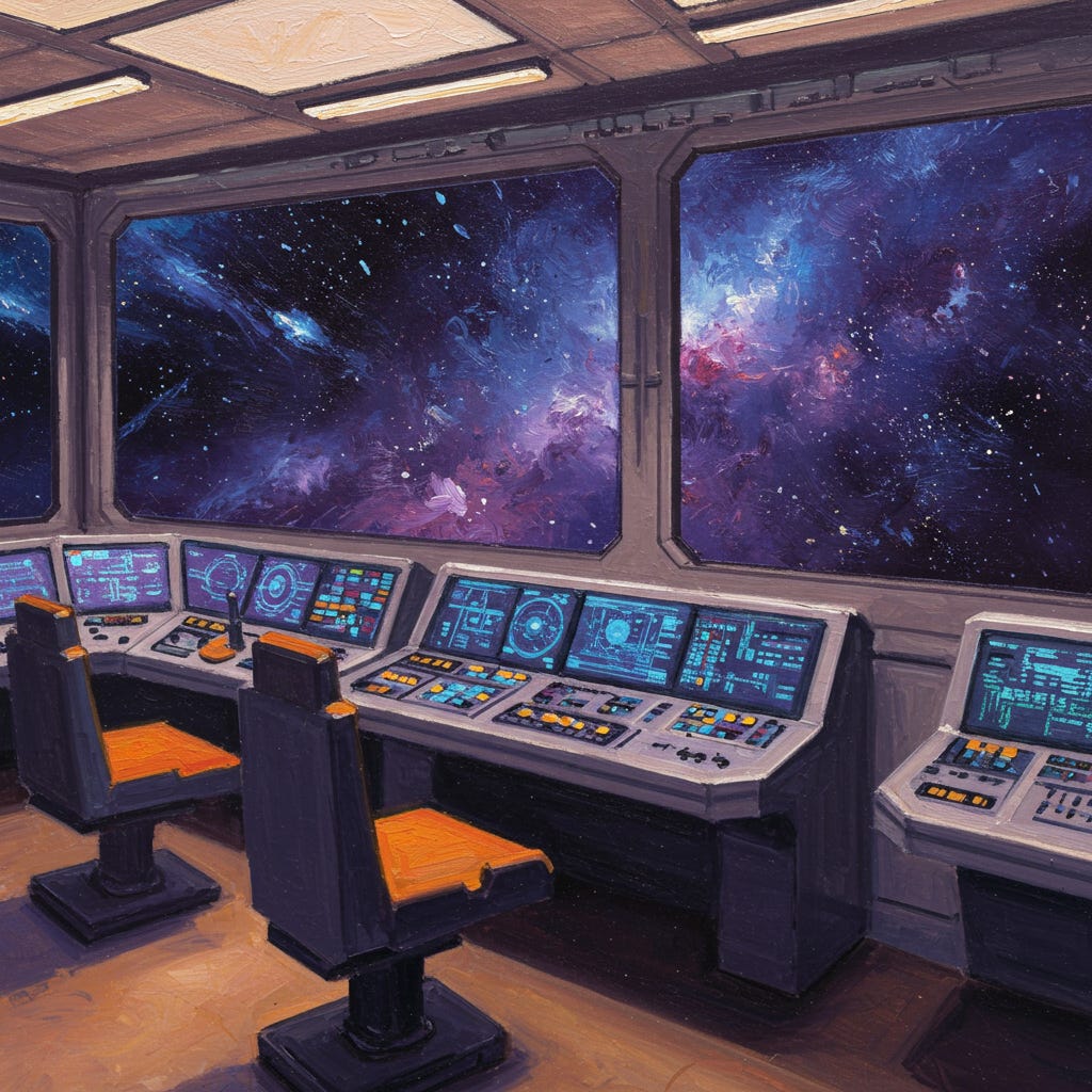
An impressionist oil painting of the control room of an interstellar star ship.
An interesting prompt where we veer into science fiction for the first time as well as providing a non-traditional subject for impressionist paintings.
The core takeaway from this test is that the differences in style interpretation for impressionism is consistent across vastly different subjects. The same stylistic variations discussed in the medieval market analysis reoccur here.
SDXL (Base Model)
In these images we can see the signature SDXL looseness and relative lack of detail, resulting in a somewhat dreamy loose style that goes well with impressionism. In terms of the subject we see a consistency as well, with a penchant for hard-angled consoles and, interestingly, contemporary office swivel chairs. Large glass windows also appear to be a consistent feature of the model’s aesthetic.


Juggernaut XI (SDXL Finetune)
As with the previous run, Juggernaut’s enhanced detail and clarity does seem to work against the impressionistic style, though in this case it does result in an interesting style somewhat reminiscent of old paperback sci-fi novel covers.
The core preferences of the base model appear to shine through mostly unaffected with a slight change to the preferred colour palette. Whilst SDXL base appears to favour a warmer, orange and purple toned mood across its variants, and we do see the echos of that in the floor colouring of the first picture, Juggernaut appears to prefer a cooler tone, favouring the blues. This colour difference combined with the crisper line work give Juggernaut’s images a clean, fresh and open feeling compared to the more claustrophobic feeling images of SDXL base.


Dreamshaper XL (SDXL Finetune)
Interestingly, Dreamshaper repeats all of the core changes of Juggernaut including colour palette shift. The core difference between the two finetunes appears primarily in the details, which are significantly increased here. Much as with Juggernaut, this detracts from the “impressionism” style, but does create a fairly pleasing painterly style of its own.


Stable Diffusion 3.5 Large
As with the SDXL models, SD 3.5 struggles a little to capture the “impressionism” feel, though it does do a better job of capturing painterly styles here. We can see consistency across the variants indicative of the model’s aesthetic preferences, favouring cold blue and yellow colouring; even more so than the SDXL finetunes as it does not feature echoes of the base SDXL warm palette.
Interestingly SD3.5 also appears to favour a different style of “control room”, giving us a much smaller one or two-person room and control panels that appear even more retro than in the SDXL models, involving analogue controls and displays. The end result is much lonelier than the SDXL models.


Recraft
Recraft demonstrates its mastery of artistic style again, particularly visible in the background outside of the windows of the control room in the images. Interestingly the subject does appear to have tempered this style slightly compared to what Recraft showed in the medieval market run; we’re seeing slightly cleaner lines and details within the control room.


Imagen 3
Imagen surprises us here by providing considerable consistency in its composition, framing and general subject interpretation, whilst showing just as considerable variation in the starfield backgrounds and overall colour palette. All of the images are considerably warmer than SD 3.5 or Recraft, but the colours run the gamet here from warm oranges set against blues and purples, to absolutely bathed in golden yellow light.
Imagen, in its third and fourth images particularly, is the first model to give us a much more claustrophobic, closed off vision of a control center as well, discarding large glass windows in favour of more wall-mounted display panels and angled lines that draw the eye, making the area feel even smaller.


Flux.1 D
Flux struggles with the concept of impressionism, as it did in the previous run, but this time also seems to struggle somewhat with the subject matter, showing little consistency across generations.
Colour palette is consistent, consisting primarily of shades of cold blue, with red favoured for seating. Additionally each image features a single large window to the outside and three of the four show images of a second star ship. Beyond that, and the digital-painting like style, Flux also makes some strange choices in subject. Not only do three of the four images contain another star ship but one of them features a ship directly inside the control panel, playing havoc with senses of scale. Both impressionistic prompts resulted in reasonably disappointing performance from Flux.


Pixelwave (Flux.1 D Finetune)
Pixelwave seeks to make up for the base model’s “barely impressionist” styling by going all in, creating a difficult to understand and muddy but fascinating and certainly unique style. Pixelwave choses to focus on the background in three of the four variants, to the point of adopting a strange wall-less version of a control room that is directly open to the outside, with an extremely colourful dab-impressionist style starscape dominating the image.


Prompt Seven
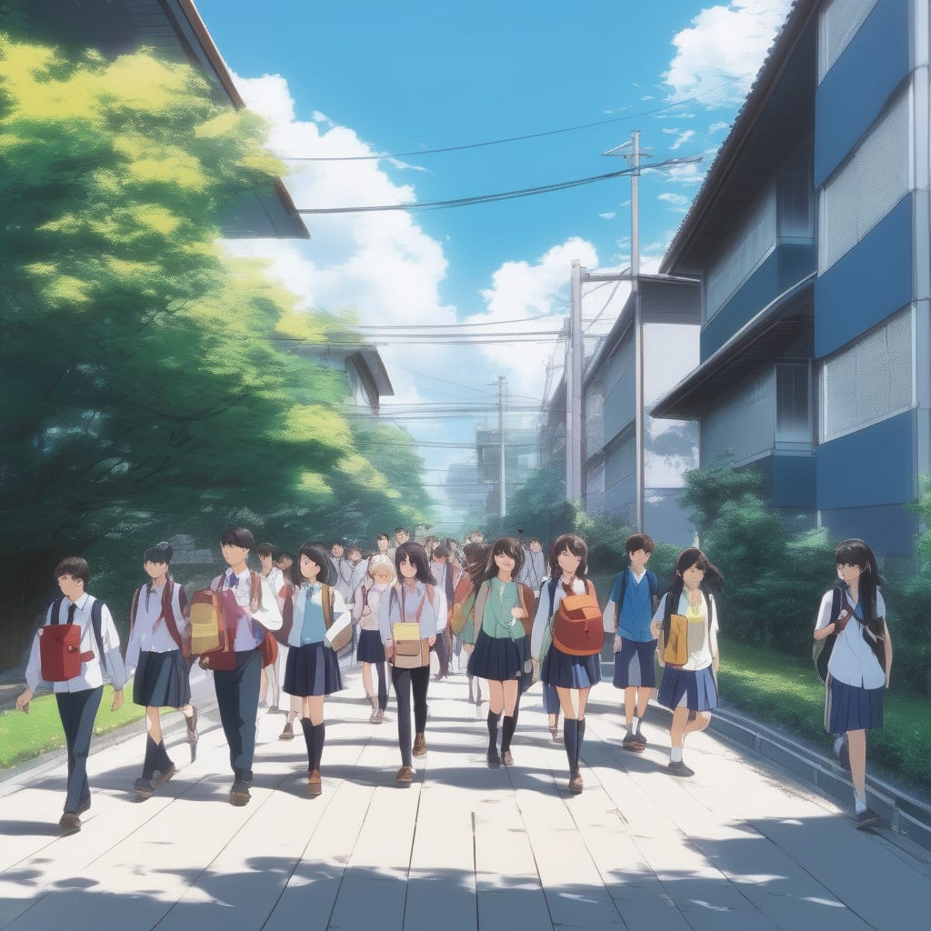
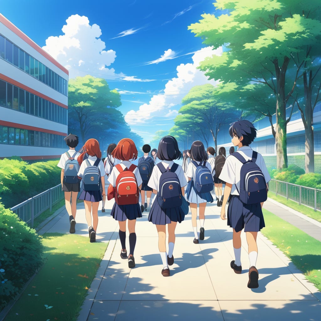
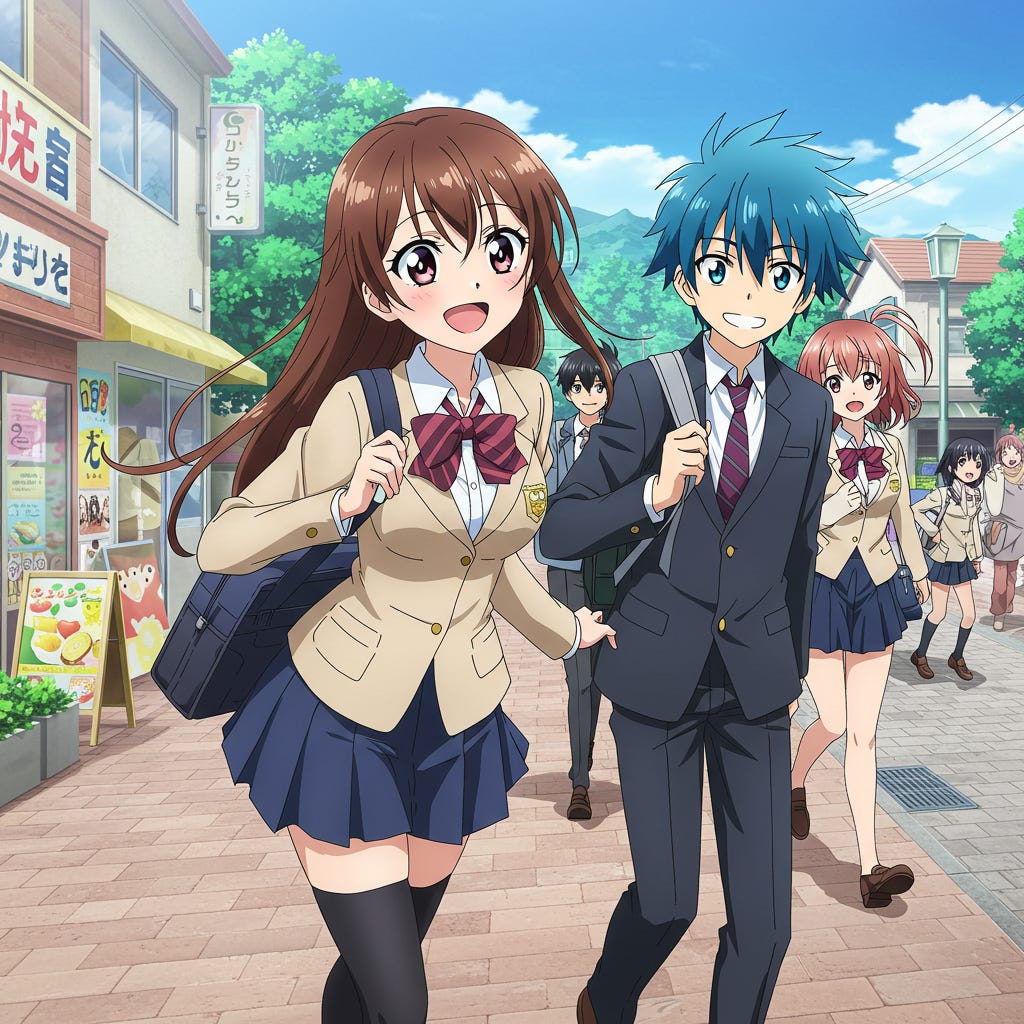
A picture of students walking to school in an anime style.
Anime/manga is a very common image style amongst AI artists, so it felt right to see how the different models would choose to represent the style. Many anime’s feature schools and students, so what could be more natural than students on their way to school in the morning?
While all models were able to make an attempt, it was surprising how varied the quality was when compared to the more realistic images tried earlier.
SDXL (Base Model)
By now we can point to certain features that seem to be indications of the model’s overall aesthetics, having showed up across multiple styles. For SDXL, the biggest one is the soft focus of the images and the relative low levels of detail, shown here in the lack of faces on the students.
We can see the core aesthetic SDXL associates with the prompt here, a quite large group of students, framing the image as a shot down the length of a straight suburban street, a clear sky, and for some reason it seems to favour showing the students themselves from the back.


Juggernaut XI (SDXL Finetune)
Juggernaut presents us with a cleaner, more vibrant version of the same basic scenes composed by the base model, though it is difficult to determine just how much more detailed the character styles are as the model also doubles down on SDXL’s “from the back” preference.


Dreamshaper XL (SDXL Finetune)
Dreamshaper seems to struggle a little with composition, sticking to the same basic preferences as the base model however struggling to determine whether it wishes to show the students from the front or the back and trying to do both at once in image four. It also seems to be somewhat lacking in character details when compared to the Juggernaut model, offering a simplistic and somewhat unbalanced face that doesn’t seem like a match with the rest of the image, which is a quite well-rendered anime-style cel-shaded background.


Stable Diffusion 3.5 Large
In comparison to SDXL, SD3.5 appears to have quite a detailed style for anime; or so it would seem. Like SDXL however, when dealing with this prompt SD3.5 prefers to display its student from behind, hiding much of the details and, crucially, their faces.
What we can see is a bright and vibrant colour palette that is consistent across variations and a more interesting understanding of what a suburban street should look like, complete with different styles of building, public transport, and a broader city visible in the background. SD3.5 essentially adopts the same basic aesthetic as SDXL with improved styling.


Recraft
It may not be as visually pleasing as the other models, but Recraft certainly has its own unique take on the aesthetic of an anime image. There isn’t necessarily a single definition of what makes a style “anime” beyond “in the style of japanese animation”, but there are some common features that most share, such as the large, expressive eyes on the characters, the general shapes of the faces and hair, the types of backgrounds used. Recraft has certainly given us something that can credibly claim to be anime, though its colour palette is much more muted than usual and there is a certain unusual realism to the faces of the characters.
It is a unique style. The dark skies, defeated look on the students faces, hunched shoulders, all contributes to an overall sense of gloom that isn’t usual when considering the prompt.


Imagen 3
In comparison to the gloom of Recraft’s style, Imagen is leaning in the the Moe, hyper-expressive style of anime; all smiles, colourful hair and short skirts. Compared to earlier models, we’re seeing a slightly different take on the streets the students walk, these ones including convenience stores and other more built-up amenities. There’s also a lot more variety in the clothing; recognising the context as suggesting school uniforms and showing flexibility in what that looks like, from the fairly formal uniform of the first image (and extremely formal uniform of the fourth image) to the much more relaxed outfits of the middle two images.
The colour palettes are bright and vibrant and each image bubbles with energy both on the expressions of the characters and the sense of movement in their positioning. More than any others we’ve seen so far, Imagen is able to infuse a sense of dynamism into its images here.


Flux.1 D
Flux seems quiet after Imagen’s efforts and that is a good way to consider the aesthetic on show here. Like Imagen, Flux leans in to the general features of Anime, with a bright colour palette, expressive faces and a variety of casual and formal uniform clothing for the students.
The key difference we see here is one of moderation. If Imagen is turned up to 11, Flux is down around a 5 or a 6, everything is slightly more muted. The colours are not quite as bright or vibrant, the characters are proportioned slightly more realistically, giving them less of a “cutesy” look to them. The expressions on their faces as less exaggerated, and even the sense movement, which is quite well captured, is less manic and energetic. It’s a capable but quieter version of the anime style.


Pixelwave (Flux.1 D Finetune)
Pixelwave has shown, throughout these runs, that it excels in differentiating its visual styling from its base model, for better or worse. In this case it unlinks itself from the base style a great deal, offering significant variants not only in style but in composition, setting and camera angle. In doing so however, it appears to have become slightly adrift itself; this is a model without a strong opinion as to what an anime picture should look like. All four variants feature a completely different style of character drawing, from the semi-realistic proportions of the first image to an extremely stylised version featuring exaggerated heads in an almost chibi style in the final image. Likewise with the settings which seem to range from a suburban street in a large city, complete with tall brick walls and many power-lines, to what would appear to be a rural setting with dirt roads. The general feeling here is confusion, and a lack of clear preference or direction.


Prompt Eight
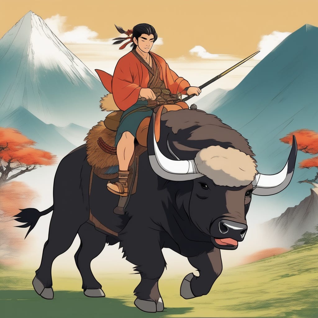
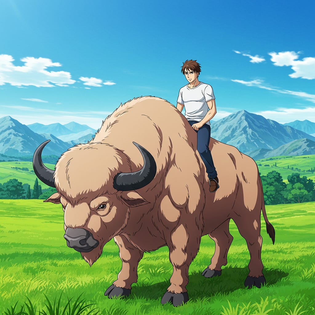
A picture of a man riding a buffalo in an anime style.
As with the other tests, the second run on a style is designed to be slightly more off-the-wall. Students walking to school is a fairly normal thing to render, buffalo riding seems like it should be somewhat less common.
All of the models were able to render the scene to some degree, though with surprising results given the previous anime results.
SDXL (Base Model)
Though the previous SDXL anime attempt was notable mostly for its lack of detail in the character, with a somewhat fuzzy stylised background, it would appear that buffalo riders are more up its alley.
Distinctive elements consistent across variants include both the subject and background. In the background we have a washed-out mountain-scape, almost watercolour-like, which works quite well for this type of image. We see slight variations in the rider and buffalo details but the general shape and size of both is fairly consistent, as is the colour of the rider’s clothing oddly enough. It does match with the general palette which consists primarily of oranges and browns, with blue serving for contrast.


Juggernaut XI (SDXL Finetune)
A more vibrant colour palette and better general details particularly in the backgrounds are shown here, but the general subject and composition details shine through from the base model. There is an oddness with the 3rd and 4th image that we’ll see in later models as well where the pose of the rider and buffalo don’t quite seem to match. There’s a sense of movement to the rider, clothes streaming in the wind as though moving forward, yet the pose of the buffalo looks more like it is braced against moving, it’s a sour note in an otherwise effective set of compositions.


Dreamshaper XL (SDXL Finetune)
In this run the Dreamshaper model has added considerable detail, particularly to the backgrounds and the ground texture, adding a great deal of additional richness to the image. The composition, framing and subject details shine through from the base model but like Juggernaut, the style has shifted considerably. The fourth image suffers from the same issue as the previous model, a seeming mismatch between the poses of buffalo and rider that upsets the sense of dynamism in the image.
Overall all three SDXL based models show significant aesthetic variation despite sharing a set of basic preferences that can be traced through the three.


Stable Diffusion 3.5 Large
SD3.5 is surprising us with a significantly different take on both subject and style than the SDXL models. The style in this case is much more realistic, sharing a lot more features with western comics than what we think of as traditional anime, but it is consistent across variations showing definite aesthetic preferences.
Each variant shares a bright colour palette of red and blue for the rider and buffalo respectively, as well as the basic shape and size of the main subjects. It also captures a sense of speed and ferocity that was lacking in earlier images.


Recraft
Recraft reprises its previous style with a more muted and realistic take on anime, though it arguably works more effectively with these images rather than the rather grim student images.
Interestingly we also see a return of a common motif in Recraft; the use of a slanted angle on the ground plane to add visual interest and enhance the suggestion of movement. We’ve seen this enough times now from Recraft across a variety of styles to suggest it may be a general aesthetic preference baked deep into the model itself.


Imagen 3
Despite its strong showing in the student prompt test in the buffalo rider one Imagen doesn’t seem to do as well with the subject. Whilst retaining the vibrant colouring and strong stylings it showed earlier, it suffers worse than the previous models at issue with disconnect between the subjects. Though the first image is reasonable, showing rider and buffalo at rest, the others all show a rider braced for fast riding, and a buffalo who does not intend moving anywhere. This apparent disconnect subverts any possibility of a sense of unified movement in the images and appears to be a consistent issue with this prompt.
In addition to this, the framing, composition and general rendering of the buffalo in all four images goes beyond mere consistency and looks like a case of lock-in, suggesting the model is worryingly narrow-focused when it comes to preferences around this subject.


Flux.1 D
Flux manages a comfortably consistent aesthetic across all generations here, while allowing variation in mood and composition. Noteably whilst every other model so far has remained fairly conservative when it comes to poses for the buffalo, Flux provides far more dynamic “in movement” positions, bringing a richness to the overall images that is missing from some of the earlier ones.
The style itself borders on barely anime however, with the third and fourth images in particularly looking far closer to western style comics instead.


Pixelwave (Flux.1 D Finetune)
Pixelwave once again sets out to be the most unique of the models, doubling down on the dynamic buffalo posing and adding far more variety to the riders as well. The aesthetic itself, like its base model, walks the line between western and Japanese but the style of the riders help ground the images in the anime style.


Step Two: Substance
The intention of this section was to experiment and see what the models preferred aesthetic is when there is no style request at all, just a simple subject request. The models almost universally agree on each prompt and for the most part go with photorealistic as their preferred option. This is what I suspected would be the case from the earlier tests as the models tended to all perform more consistently on the photorealistic tests than the more stylised artistic ones.
What was interesting though was what the prompts revealed about the inbuilt bias’ in each model. As discussed at the beginning of the model, bias is not necessarily the problematic element in artistic models that it is in purely functional ones, where fairness is valued more than creativity and artistic direction. However too much bias is creatively restrictive and we will see exactly that in these first two prompts - a concerning amount of bias.
Prompt One
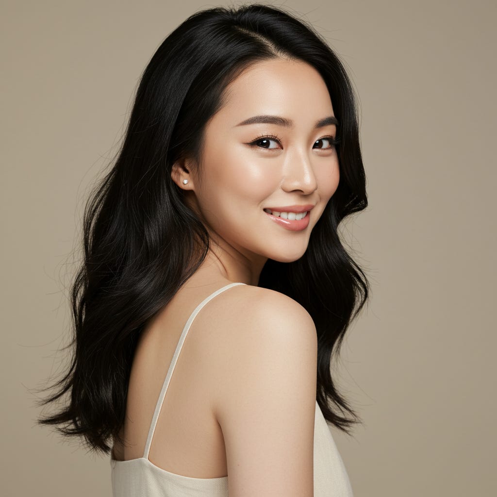
Beautiful woman
I picked the first two prompts, beautiful woman and handsome man, as an extremely simple test on what are likely the most common generated image; people. Despite the simplicity of the prompt we can learn a fair bit from the unrestricted answers to this prompt: How the model thinks women, particularly beautiful women, should be rendered, what style is best for doing so, and what constitutes beauty according to the model’s training.
SDXL (Base Model)
SDXL, as we’ve witnessed in earlier tests, tends to default to a painterly style that isn’t quite photorealistic and it picks this same style as its preference when generating an image of a beautiful woman.
We start off a little worryingly with a group of images that are remarkably similar, suggesting a fairly narrow definition of what a beautiful woman looks like in the base model. We also get a fairly narrow range of framings: one full body shot and three close-up portraits, with a little variety as to how realistic or painterly they look.


Juggernaut XI (SDXL Finetune)
Juggernaut has added additional photorealism as it tends to, however it appears to have also narrowed the definition of beautiful woman even further. Whilst there are some differences it wouldn’t be out of the realm to claim all four images are of the same person, or at least fairly closely related people. There are even similarities in hair style and preferred jewelry, such as earrings between the generations as well.


Dreamshaper XL (SDXL Finetune)
And sadly Dreamshaper continues the trend, providing us either four images of the same person or at the very least very similar looking sisters. In this case, the model has also decided in 2 of 4 of the generations that “beautiful woman” suggests she should be outside in her underwear as well.
It’s safe to say SDXL has a significantly narrow bias in terms of beautiful women and the finetunes only seem to aggravate the bias even further. Dark hair, dark eyes, a slim build and light-coloured clothes all appear to be core features of SDXL’s preferred aesthetic here.


Stable Diffusion 3.5 Large
It seems likely that Stability.AI was aware of the bias in their previous model and set out to at least partially ameliorate it in the newest version of Stable Diffusion. As you can see from the below, SD 3.5 L shows significantly more variety in terms of both race and style and gives us one quite arty variant with the flowing pink. It does seem to have a preference for angled face portraits though which I am told is a particularly popular photography pose for emphasising symmetry so may well be over-represented in training data.
These results do follow with the prevailing opinion which was that of the latest open weight base models, SD3.5 currently provides the best variety in faces during image generation.


Recraft
Recraft shows us its abilities at mimicking photography, but come on… I’m not even going to hedge this time, that is four pictures of the same woman, even in the same clothes and in more or less the same pose! In Recraft’s aesthetic model, beauty requires brown, wind-blown hair, beige clothing and an inane smile.
Notice the angled compositions, particularly in the fourth image. I’ve started to think of that as the “Recraft” angle.


Imagen 3
Imagen once again gave me only three results during this run, suggesting something about the fourth violated terms of service. Interesting the subjects we are generating when that happens.
We have some significant variety in terms of race and facial type here, but almost as many consistencies as well. Two of the three have more or less identical hair-styles, almost down to the individual waves, despite the difference in colour, and the third is similar just shorter and more wavey. All of them look very much like posed studio photos, all in the same pose and with very similar coloured backgrounds. This feels like training was directed towards a specific sort of diversity and not as much attention paid to other elements, leaving Imagen with a particularly narrow set of preferences.


Flux.1 D
Flux doesn’t have the best reputation for face diversity however has at least made a token effort with this prompt. There are a lot of similarities in the faces, but not quite as egregious as the SDXL models or Recraft. It has decided on underwear as the clothing of choice on one variant but this is offset a little by the first image which has chosen quite a nice full length jacket and turtle-neck combination, a unique aesthetic in this run so far as the other models have generally preferred more traditional “glamour” clothing.
In fact despite the fairly lacklustre variety on display, that first image is likely my favorite of this entire prompt test. It’s hardly a candid shot, still overly glamourised and “magazine” ready, but there is also a sense of reality to it that is lacking in many of the others.


Pixelwave (Flux.1 D Finetune)
Pixelwave manages to go two ways at once here, both narrowing and broadening the preferences of its base model. On the one hand the faces here are quite similar, even more so than the Flux.1 D base model, suggesting a further narrowing of preferences towards type, on the other hand we have both more variation in pose and a slightly less polished, more candid look than is present in the base model as well.
I can’t help but notice that the third image does appear to be naked however. Or, perhaps, just wearing a strapless top and cropped too high up? Somewhat galling after we just finished praising the base model for choosing better clothing but perhaps this is merely showing the width of the variety the model considers beautiful - from fully clothed to fully unclothed does seem a healthy opinion at least.


Prompt Two
Handsome man
It perhaps shouldn’t have come as a surprise that this prompt, the male equivalent of the previous, should show even worse diversity and variation than the previous one, but the extent to which this is the case is remarkable.
SDXL (Base Model)
SDXL starts us off with extremely strong and set preferences. A handsome man is dark, slightly European and generally short haired though apparently exception can be made for this 80’s perm going on in the first image.
Additionally you must have designer stubble (no clean shaves or full beard) and preferably be one of the four brothers shown below.


Juggernaut XI (SDXL Finetune)
Juggernaut decides to double down on the SDXL preferences but does away with the 80’s perm (what were they thinking). A handsome man has exactly one hairstyle, gelled three-quarter part swept at the front. We’ll keep the stubble however and add in a button-down shirt with the top buttons undone to show off his chest. Also, you have to be this guy or one of his near identical siblings.


Dreamshaper XL (SDXL Finetune)
Naturally, Dreamshaper has to get in on the act as well in this beauty-defining game of “yes-and” and says “hold my beer”. We’ll keep the short three-quarter part hair, strong jaw and stubble, but the plunging V-line of the shirt was a mistake. A handsome man wears a suit, and is this guy. No siblings this time because that is absolutely four images of the same man.


Stable Diffusion 3.5 Large
Whilst we saw SD 3.5 show a great deal more variety in the previous prompt, this only applied to beautiful women it seems, not handsome men. We have diverged from the preferences of the SDXL models; here we eschew the three-quarter part in favour of an early 2000’s style messy “I spent 200$ to look like I did nothing to my hair” look, but we keep the dark colouring, strong jaw and designer stubble. The core variations here relate to whether or not to wear sunglasses or no shirt, as seen below.


Recraft
Recraft shows slightly more variety here than it did on the beautiful woman prompt, but only slightly. It still has very specific requirements for a handsome man though they differ from the Stable Diffusion checklist.
We have shifted to a lighter colouring with this model, and a well-gelled upswept haircut designed to show off impressive widows-peaks. (They are so in right now.) We’re going with expensive casual for the clothing styles with a heavy focus on jackets and under no circumstances may a handsome man look directly at a camera; three quarter profile shots only. The one consistency so far amongst all handsome men appears to be that stubble.


Imagen 3
Imagen makes an attempt at variety, giving us one image of a different race and one unique amongst all the generations in this prompt test - a slightly older man! Imagen has a definite preference for fully suited men and appears to be reusing the backgrounds from the beautiful women photo-shoot earlier. To imagen apparently a handsome man is a stock photo on a corporate annual report.


Flux.1 D
Flux makes a half-hearted stab at variety but still manages to give us three of essentially the same sort of face, though at least varied compared to the other models. The main point of difference here is the first image, which is the first one that feels like it departs from the staged model-photography look of most of the others. While there is still too much perfection for it to be a truly candid photo, it is the closest we have seen so far.
It would seem that short dark hair is still the mark of a handsome man, reverting back to the 3/4 part again and, of course, the stubble. Shirt optional.


Pixelwave (Flux.1 D Finetune)
Pixelwave doesn’t really manage to break the pattern completely, reverting entirely to “model-pose” style photography and the short-dark hair & stubble look is still represented. It does give us one fairly unique variation here though, both in subject and in composition, which does lead me to wonder how it might progress if given more attempts. There is still a very obvious bias, but its possible there are a slightly wider set of preferences possible than in the other models.


Prompt Three
Downtown Tokyo
We move now from the reasonably narrow results of the portrait prompts and on to city images. There are a myriad of ways to display a city so there was wide scope for creativity here but generally most results followed one of the two most common photography patterns - overheard establishing shot or street-level photography.
SDXL (Base Model)
The first image from SDXL is a unique offering for this prompt test, the only time a model took advantage of the open prompt to offer up a more creative option than the usual photorealistic photograph and instead gave us a graphic representation in an almost isometric style that honestly I quite like.
Beyond that we revet to much the same style preferences we saw on the waterfall prompts; high angle photography looking down at the subject, and making use of a common city-photography stylisation - using long exposure to turn car lights into beams of light tracing the city streets. Effective use of photographic trickery and one we shall see more than once in this set.


Juggernaut XI (SDXL Finetune)
Juggernaut gives us a series of overhead shots, moving away from street-level altogether. It makes good use of the long exposure to show lines of orange lights flowing through the city like fire in two of the images, making for very effective imagery.
I thought at first the other two shots were meant to be more artistic, showing start white buildings that look somewhat unreal, like a screen from a video game using colour to represent statistics on that area of the city. After seeing it show up from other models however a search shows that a lot of buildings in Tokyo are actually that colour, though no-where near as stark as displayed here. It’s a striking look that appears to be a consistent preference.


Dreamshaper XL (SDXL Finetune)
There is not a great deal to say about Dreamshaper’s offering as it is fundamentally identical to Juggernaut’s; high angle overhead shot, long exposure, stark white building view.
The main thing that differentiates the two models is Dreamshaper once again shows a higher command of details, resulting in the long exposure shots looking more realistic than Juggernaut’s offering, but its close.


Stable Diffusion 3.5 Large
SD 3.5 shows a marked preference for street level shots with the familiar “down the long street” composition and people shown not too close to the foreground. One very noticeable aesthetic preference however can be very clearly seen in the first image, the way the trees are rendered. This is noticeable in some earlier SD 3.5 photorealistic images too, the model seems to struggle with how to portray trees, at least in urban environments. What we end up with are these somewhat insubstantial renderings that feel almost ghostlike against the buildings. Artistic perhaps, but not realistic.


Recraft
Recraft appears back in its element now and shows very marked aesthetic preferences. As in previous prompts, this models’ photorealism is quite impressive; the preferences here seem to be related primarily to the subject. Each image if framed very similarly, with an open space directly in the foreground and the lines of the road directing the eye towards the towers further to the back, obscured by distance haze. Recraft images do lean towards effective composition, even if it is relying on much the same tricks over and again. The lighting is consistent across all generations, a sort of twilight grey sky; dark enough to show off the impressive lighting of Tokyo but light enough that detail isn’t obscured. It is an effective aesthetic that manages to avoid feeling overly staged whilst still looking like the result of careful planning.
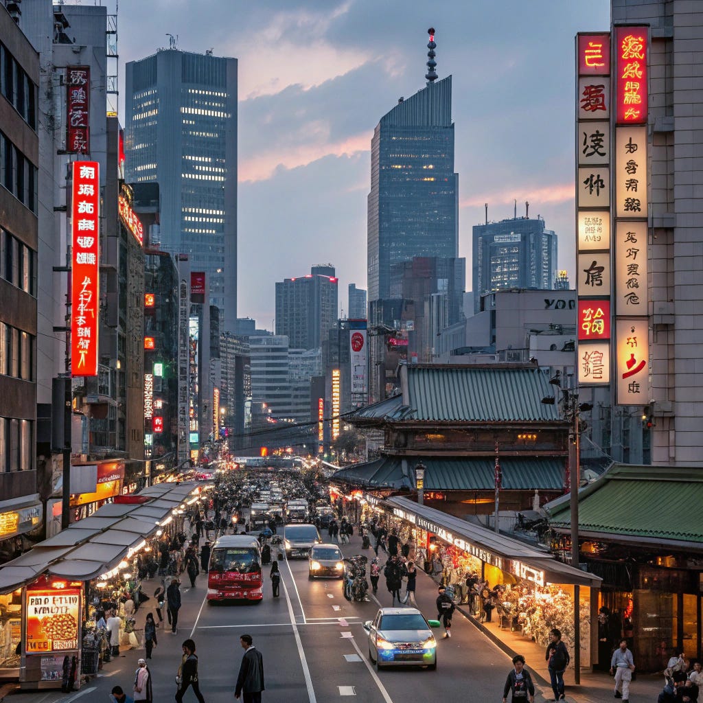


Imagen 3
Imagen 3 provides some variety, including a single overhead shot amongst the street-level shots and the first one, a much closer and more intimate photo than those provided by other models so far, showing people in the foreground. We see variety in lighting, including both day shots and a night shot showing off the bright lights of the city. We also see both open city crosswalks and this pedestrian street complete with snack carts and small convenience shops. This first image is my favourite of the prompt run, it’s the one that feels most “real” and least staged and contrived.
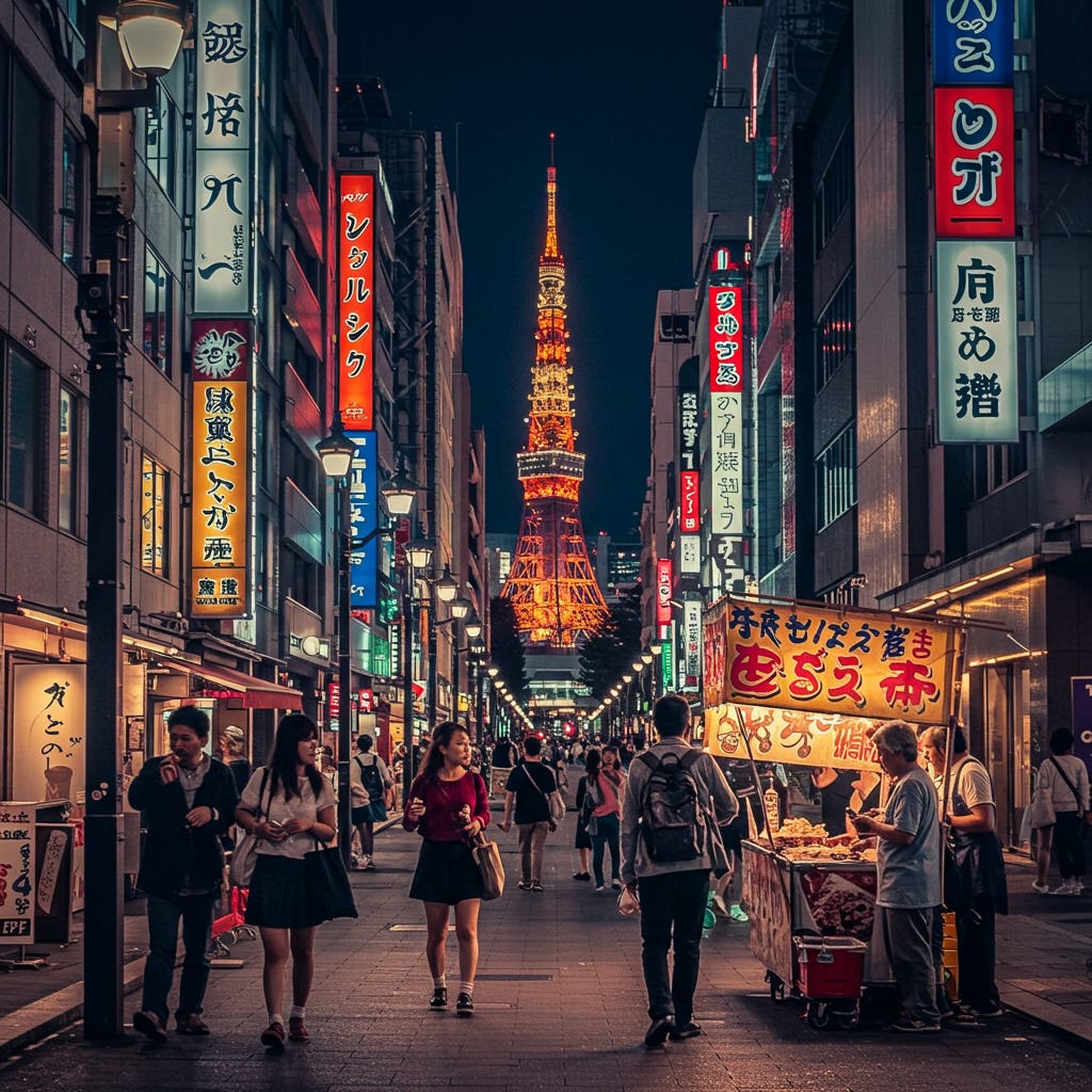


Flux.1 D
Flux has only one view in mind when it comes to downtown tokyo and it is very specific. Standing in the middle of a long street in the middle of the day looking down the length of it, traffic approaching optional. It is reasonably effective for what it is, but it suggests an extremely narrow set of preferences.


Pixelwave (Flux.1 D Finetune)
Pixelwave isn’t choosing to substantially change its base model preferences when it comes to downtown Tokyo however as a more safety conscious model than Flux.1 D it has decided to get out of the middle of the road and take its photographs primarily at an angle, from the sidewalk.


Prompt Four
A space station orbitting a jungle planet
We diverge back into science fiction briefly now to see how the models display a different style of “landscape” image. Poorly, seems to be the general consensus, though we did get a couple of nice images and some interestingly consistent errors.
SDXL (Base Model)
SDXL presents us with its signature fuzzy, painterly dreamscape style image once again, and in the context of this prompt the style works fairly well. The key elements, space station and jungle planet, are represented here however rather than orbiting for some reason the model decided on “hovering”. As well as creating an awkward composition this has a fairly disastrous effect on sense of scale within the image.
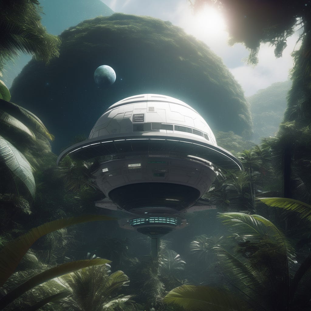


Juggernaut XI (SDXL Finetune)
As we have come to expect by now, with Juggernaut we get the standard SDXL preferences with a more crisp and detailed aesthetic style. We continue with the “station in the jungle” composition here, though get some interesting variations on the shape of the station.


Dreamshaper XL (SDXL Finetune)
Dreamshaper makes some modifications to the base model preferences; choosing a strange spherical construction for the station, centering it in the frame from a low angle and, for some reason, deciding to add jungle on to the station as well as around it. These changes have come at a significant cost to versatility however, as this image is fairly rigidly consistent across all four variations.
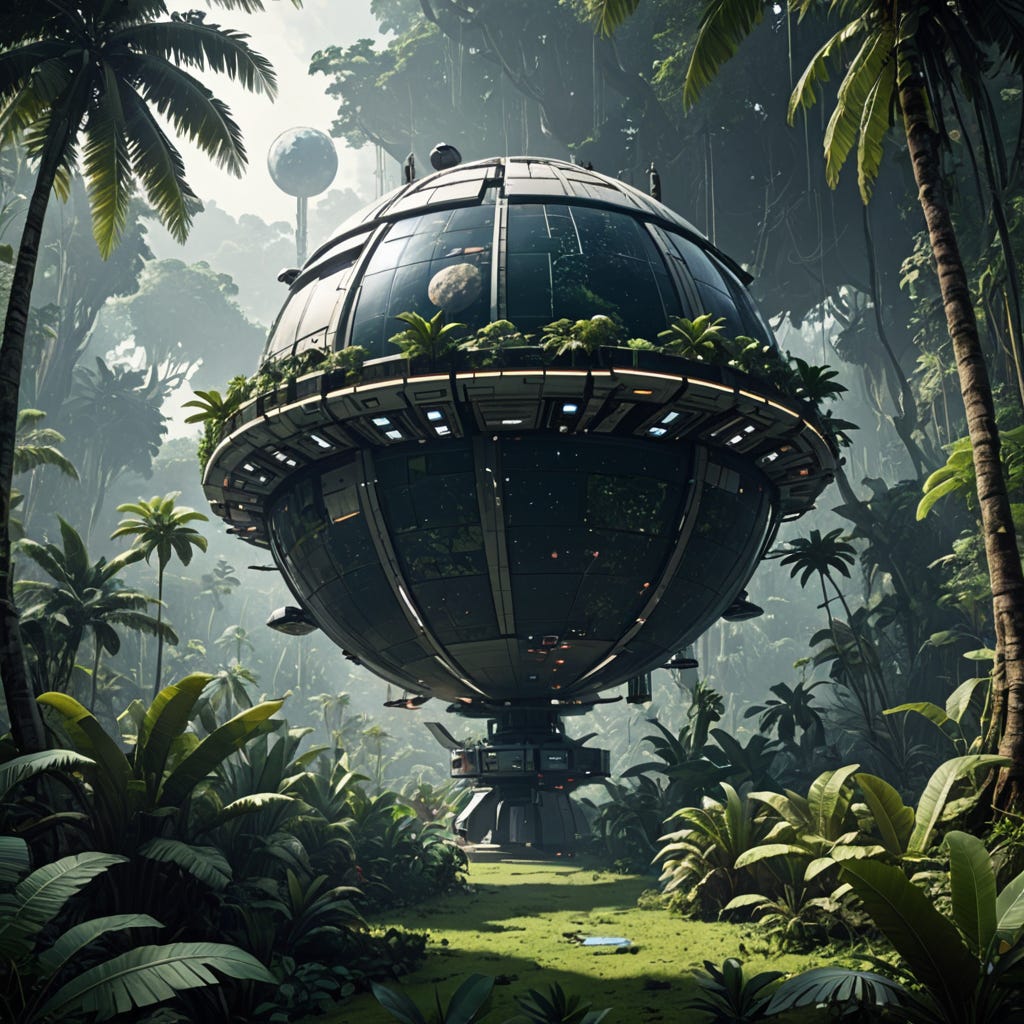


Stable Diffusion 3.5 Large
SD 3.5 gives us both a more realistic style and the first image to understand the prompt well enough to actually present an image of a space station in orbit around a jungle planet. Unfortunately it shows significant confusion around the prompt as well though, its preferences too weak to be consistent in both style and subject; as well as the orbiting image we have two variants that are much more in line with SDXL’s interpretation and one that might be considered an orbiting station, but is a very exaggerated illustration and difficult to compare to the others.
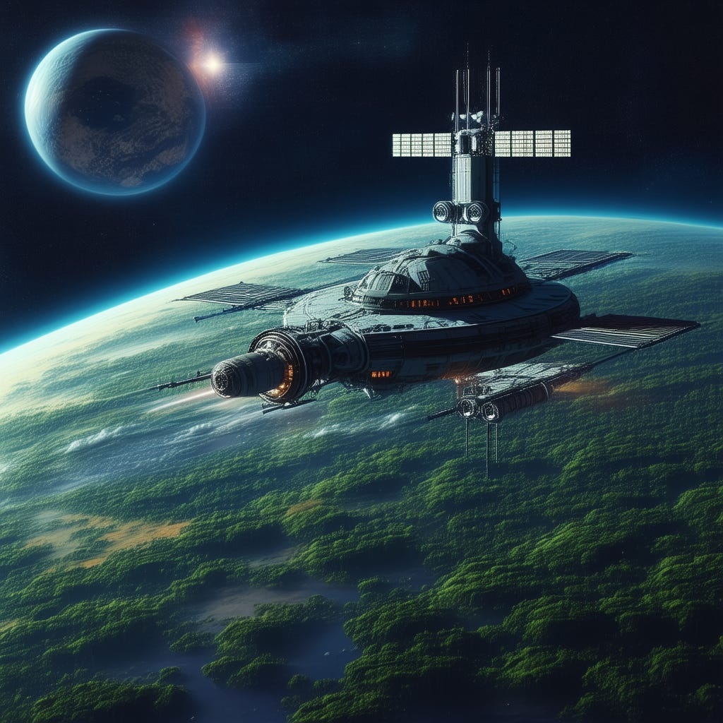


Recraft
Recraft has made several puzzling choices in this prompt and made them consistently enough that they appear to be preferential rather than a glitch. Unlike SDXL, Recraft does give us a station in space orbiting a planet. Rather than putting the jungle on the planet however, it appears to have brought the jungle itself up into space, giving us a weird, almost surreal style of image.
Backdrop, colour palette and station appear consistent across generations as well, going for a more contemporary rendition of a space station rather than the more science-fiction based one shown in other models.
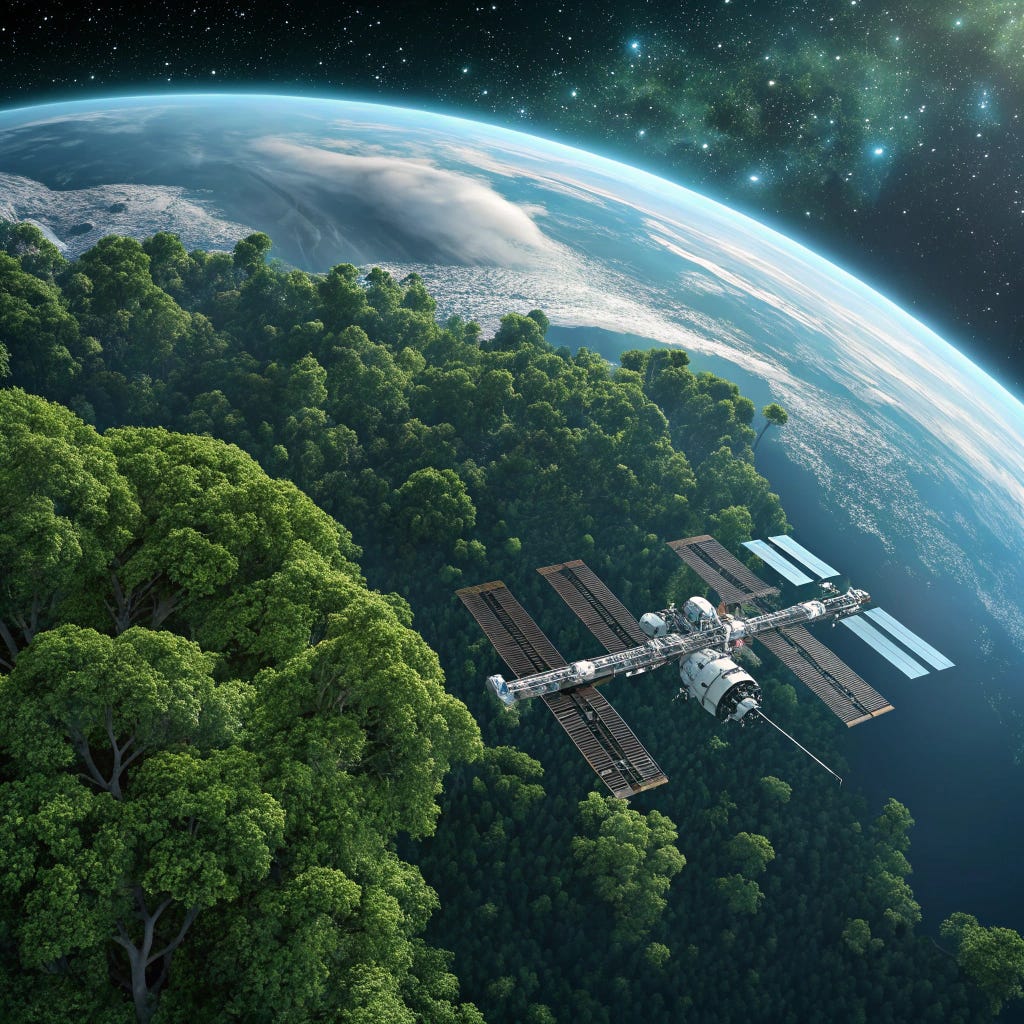


Imagen 3
Like Recraft, Imagen has show a distinct aesthetic preference for a more contemporary style of space station to the “space city” style science fiction inspired stations. Unlike Recraft, in these images the jungle stays on the planet where it belongs. Imagen shows remarkable consistency in style, colour and subject across all versions of the image, varying primarily by composition and framing.
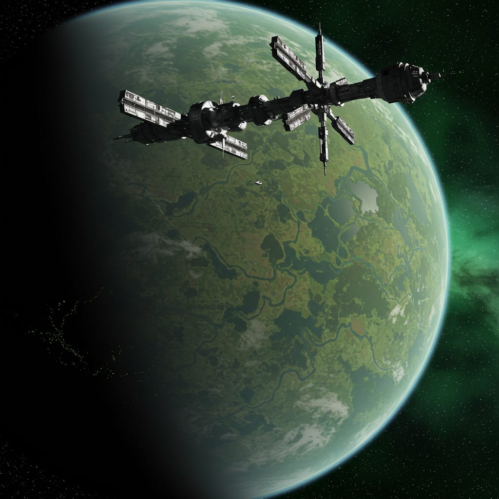


Flux.1 D
Flux suffers from the same issue as the earlier SDXL models, particularly Dreamshaper, bringing the station down to the planet and planet jungle on to it and not just all around it. It provides some nice images and shows consistent style preferences in terms of colour, composition (framed by rock and tree appears to be a significant aesthetic choice here), and background. The large planet hovering ominously in the sky appears to be a major preference for this prompt as well.


Pixelwave (Flux.1 D Finetune)
Pixelwave doubles down by abandoning the idea of a space station altogether and simply building an outpost on the planet in the jungle, though in some variants retaining a station-like shape.
Despite nearly completely failing to follow what was really a simple prompt, Pixelwave did manage to generate what are likely my favorite images of this prompt test aesthetically. It shows very strong preferences here with a painterly style reminiscent of the “art-station concept art” style of digital painting and a striking use of colour and shape. The first image in particular evokes a melancholy loneliness tinged with apprehension, the overgrown station long abandoned after some sort of disaster and the huge neighbouring planet looming in the background.


Prompt Five
Bart Simpson
Our final prompt was an attempt to test several things. The first was a prompt that would not usually be created using the models’ preferred photorealistic styles, but that has a very distinctive style ready-built into the context. The other was to present a very common pop culture figure where is it incredibly unlikely the model wont know what it is and see how well they could do.
SDXL (Base Model)
Well, SDXL recognised that a cartoon was the appropriate style and obviously has some understanding of the Simpsons, but that’s about all we can say for it. These generations are horrible.


Juggernaut XI (SDXL Finetune)
Juggernaut does improves things a little. Ok significantly, given what a low bar that is the cross, however it is still not a particularly good set of renditions. We are getting attempts at an individual character now, but the model is quite obviously mixing multiple characters together here. Clothing isn’t quite right, weird little mutations appear on the character, the fourth one appears to have both Bart and Homer’s hair at the same time and the second is missing a pupil. Overall, not great.


Dreamshaper XL (SDXL Finetune)
Dreamshaper decided to take a hard turn and give us photographs of plastic toy versions of the character rather than an actual cartoon rendition. They are recognisably Bart Simpson however they aren’t particularly good. They are extremely plausible as some sort of bootleg “knock-off” toy found in a liquidators store somewhere, or selling on Ebay in broken English claiming to be 100% authentic Bart Sampson toys.


Stable Diffusion 3.5 Large
Stable Diffusion 3.5, though not performing well here, does at least make a valiant effort. The pupils do still seem to give trouble, they must be a difficult feature to understand.
The real question here is why SD 3.5 decided to age Bart into his early 20’s? It’s actually a reasonably impressive “Young Adult Bart”.


Recraft
Interestingly, Recraft shows more signs of knowledge than the other models so far by putting “Krusty” on the sweater Bart is wearing here. It’s still not a great rendition of him but the other variants are far worse, apparently deciding to mix Bart and possibly the Flanders children together, with horrific results.


Imagen 3
Imagen provides the best, if most boring background-wise, version of Bart so far however it also seems to have issues with the pupils. Consistent across all variations presented, Bart appears to have some sort of concussion and is likely going to have trouble walking around with his eyes looking off in difference directions like that.
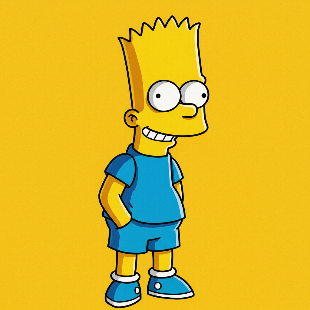


Flux.1 D
The best version of Bart we achieve through this prompt is from Flux, which is not only able to do a passable version of the character but appears to understand the Groenig’s style reasonably well as well. There are still some issues that speak to confusion in the training process visible in the variants where it presents Lisa as Bart in one, and merges the two characters in another.


Pixelwave (Flux.1 D Finetune)
Whilst it’s a better attempt than most of the other models, Pixelwave performs significantly worse than the base model with several lesser versions of Bart and some complete messes.


Final Conclusion
I set out at the beginning of this to see whether individual models could be said to have their own idiosyncratic “aesthetic” and to test my theories on the importance of “bias” in art models, and I think we have well and truly shown that they do have distinct styles throughout this experiment.
Additionally we have highlighted the narrow tightrope that model trainers are walking here. As discussed earlier a model completely without bias, if that’s even possible, is likely to feel completely lifeless and even more difficult to control; as without any preferences at all any result is as likely as any other when not directly addressed by a prompt. Bias is important.
What we have also seen though is the other side of it. A number of these prompts showed extreme narrowness of preferences, resulting in variants that were essentially the same image repeated over and over. Whilst this is likely less noticeable during normal model use, as you wouldn’t generally use such simple prompts and leave so much creativity up to the model itself, it’s important to realise that these preferences exist in the model at all times - not only when highlighted by an experiment like this one.
What this means is that whilst you can likely prompt a model to give you a beautiful woman with flaming red hair and blue eyes and it may provide it to you, any time you are prompting and do not specify precisely every detail the preferences are guiding what the model will present to you. For some of these models it seems likely if you do not specify precisely what hair colour you want on your beautiful woman, you’re getting brunette. And your handsome man? It’s stubble every time mate. (Something quite disturbing to a well bearded man such as myself. Such propaganda.)
It’s worth remembering as well that we’re dealing with very small sample sizes here. Enough across the entire experiment to make some generalisations (I whole-heartedly believe the Recraft angle is a deeply-trained bias), but each individual prompt only generated four images for a model and what appears to be bias could feasibly be a poor response from the random number generator gods. It suffices for a less-than-fully-scientific experiment like this however and I think demonstrates the point well enough to start the discussion, which was the intention. By all means however if you find different results in your own experiments, please reach out.
The key takeaways from this experiment:
Each model has its own personality and preferred aesthetic styles, from the fuzzy painterly style of SDXL to the sometimes wild remixes from Pixelwave.
No model is demonstrably better than all others in every aspect - every single model failed spectacularly during at least one prompt, and most had a hero moment or two as well as well.
Why did Imagen give us a peregrine falcon for a griffon? That’s going to keep me up at night.
Thanks for joining us! If you enjoyed this, please pass it on, and leave a comment below to let us know. Experimental articles like this one take a lot of time and effort to put together and feedback is appreciated! Let us know how your own experiments with model comparison have fared.
About Us
The High-Tech Creative
Your guide to AI's creative revolution and enduring artistic traditions
Publisher & Editor-in-chief: Nick Bronson
Fashion Correspondent: Trixie Bronson
AI Contributing Editor and Poetess-in-residence: Amy
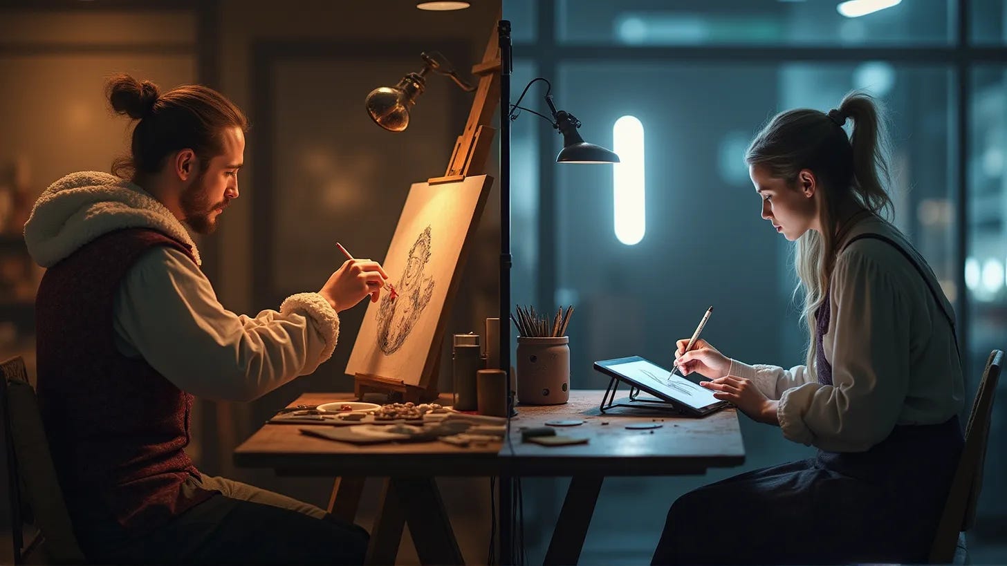
If you have enjoyed our work here at The High-Tech Creative and have found it useful, please consider supporting us by sharing our publication with your friends, or click below to donate and become one of the patrons keeping us going.
I hope you realise that this might be one of the most thorough stress-tests on this specific industry (digital art) that there are... specifically on model biases.
I am particularly intrigued by this:
"In Art models however I would argue that bias is not only desirable, it’s necessary. When we ask the question, “does a model have an aesthetic preference” we are asking, in effect, if the model is biased in particular ways. That’s what a preference is, after all, a bias towards something."
I wonder to what extent this also applies to other, non ADM use cases... I think legal professionals have a disproportionate "bias towards bias". I tested this on my own self when I did the RandomForest classifier experiments, it made me think a lot as to why we have the negative association towards "bias"- and to what extent "subjectivity" can be consider a bias.
As ever, brilliantly done Nicholas. I am terrible at art, so sorry that I cannot provide a critique on specific style and substance findings :D