


Warhol Silkscreen Style
Eye-searingly bright prompt of the week

The prompt this week is a reimagining of some very famous works, the portrait art of Andy Warhol, the mid 20th-century’s premier pop artist. Few people would be unfamiliar with the clashing false-colour portraits of famous pop-culture figures of the 60’s.
As I usually do, I paired this well known style with a less-than-usual subject matter to create something slightly different. In this case, applying the style to my current work with space opera motifs, to create a series of warhol inspired portraits of space opera “archetypes”.

Colourful, recognisable and quite fun, Warhol’s silkscreen portrait style is a great one to play with. Let’s break down the prompt.
Key Elements
Style
“a Silkscreen print (Warhol-esque)”
“rendered in bold, flat, clashing colors with repetitive patterns”
In contrast to previous prompts, this one cuts the style instructions into two parts which together form the core of how this image is rendered. The first specifies a silkscreen print (labelling it warhol-esque in to reference the model back to his work) whilst the second explicitly requests the bold and clashing colours that was such an iconic part of the work.
Subject
“series of stylized portraits of iconic space opera characters”
I like to try untraditional subjects when working with existing styles both as I like genre subjects (science fiction is always a favourite) but also because I like to challenge the models. An AI model trains to generalise “features” from vast amounts of data, and it does this without necessarily being told what features are worth preserving. Making unconventional requests puts test on that training and generalisation; rather than being asked to reproduce something similar to what it has already seen, the odds are far better that very few “warhol-style science fiction pictures” would have been directly available for training originally. This forces the AI model to choose features with a far lower certainty than it would have otherwise, and can lead to particularly interesting imagery.
Composition
“Bright, even illumination should highlight the graphic nature and pop culture appeal”
Something about Warhol’s work always screams 60’s to me; the colours are bright and uncompromising, the lighting is even and seeks to highlight rather than define. If we want something that looks like the style we’re inspired by here, we want to try and match that style of composition.
Mood
“conveying celebrity, mass production, and iconic status.”
Warhol’s portraits emphasised celebrity and pop-culture; whether you view that as an embrace of the growing worship of celebrity or a lens on the viewers themselves likely depends on how you feel about the artist, but certainly these 20th century concerns were central themes in the work.
Now lets put it all together:


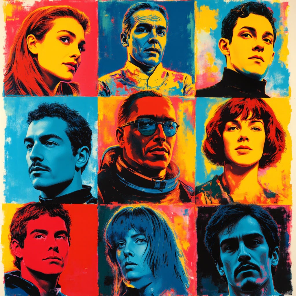
Produce a Silkscreen print (Warhol-esque) series of stylized portraits of iconic space opera characters, rendered in bold, flat, clashing colors with repetitive patterns. Bright, even illumination should highlight the graphic nature and pop culture appeal, conveying celebrity, mass production, and iconic status.
It definitely interesting to examine here how the model is attempting to combine mid-20th-century fashion, warhol-inspired styling and the request for space opera characters into images here. We can see that the model dips not only in to general “space opera” tropes but specifically into those that would be contemporary with the time; providing us with space-suits and helmets that would not be out of place in a Flash Gordon or Buck Rogers serial. In toto I find the juxtaposition of style of subject quite pleasing in this experiment.
Variations: Playing with Warhol
For our first variations this week, we’re going to try experimenting with subject changes. We’ve managed to achieve a very striking style with a reasonably small two-part style prompt here; the question is how much of that is linked to the subject, and can we easily alter the subject without losing the essence of the style? Lets try.
Iconic Architecture

Produce a Silkscreen print (Warhol-esque) series of stylized portraits of famous architectural landmarks, rendered in bold, flat, clashing colors with repetitive patterns. Bright, even illumination should highlight the graphic nature and pop culture appeal, conveying celebrity, mass production, and iconic status.
The answer would appear to be yes. The style is still recognisably similar to the previous images and we have significantly switch the subject. It’s also carried out some interesting little compositional tricks too, such as having the subjects extend past their panels in some cases, mixing and matching the landmarks in strange ways. It’s given us quite a psychedelic piece here.
Endangered Animals
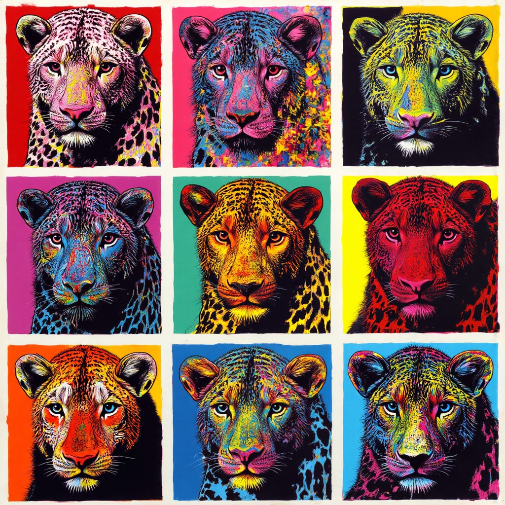
Produce a Silkscreen print (Warhol-esque) series of stylized portraits of endangered wildlife species, rendered in bold, flat, clashing colors with repetitive patterns. Bright, even illumination should highlight the graphic nature and pop culture appeal, conveying celebrity, mass production, and iconic status.
This variation has given us a very Warhol-like image by selecting essentially the same subject for each panel in the image but choosing the vary the false-colour and lighting of each, a technique Warhol himself used in several images and one that remains quite striking in this case. The model appears to have chosen a Leopard to represent “endangered wildlife species”, which fits nicely (at least for some subspecies). If anything this variation has gotten us closer to the source style than ever before.
A Quality of Light
Experimenting with subject has proven quite successful at retaining the style, the question now turns to the effects we can obtain by modifying other aspects of the image whilst retaining the overall style and subject request. Lets look first at the key compositional element of our prompt, the lighting.
Produce a Silkscreen print (Warhol-esque) series of stylized portraits of iconic space opera characters, rendered in bold, flat, clashing colors with repetitive patterns. Soft, diffused backlighting should emphasize dramatic silhouettes and a sense of quiet grandeur, conveying celebrity, mass production, and iconic status.
This image, as well as being quite aesthetically pleasing, is an excellent example of how subtle changes affect the entire quality of a style. Whilst retaining the general composition and colouring of the original, something almost indefinable has shifted, leaving this image feeling much less Warhol-like than our original images.
The key would appear to be the shading. With the lighting change and the additional emphasis on silhouette, we also gain a much greater sense of depth to each portrait. This renders them feeling slightly more realistic and less Warhol-like; a sense that is further increased by the model’s decision to move away from the 60’s inspired fashions in hair, clothing and rendering that leaves the portraits feeling somewhat more modern - more gritty 90’s brady bunch reboot than 60’s Flash Gordon inspired space crew.
The Mood is the Thing
If changing the lighting was a subtle change that produced an outsized effect, changing the mood should be even more interesting. It’s often not clear what exact effect asking for a specific “feeling” in an image will have with an AI model, but experiments i’ve written about in the past have shown the model is definitely able to shade imagery in very subtle and evocative ways. Lets alter the specified theme and see what we can get.

Produce a Silkscreen print (Warhol-esque) series of stylized portraits of iconic space opera characters, rendered in bold, flat, clashing colors with repetitive patterns. Bright, even illumination should highlight the graphic nature and pop culture appeal, conveying profound melancholy, desolation, and haunting beauty.
What is it that conveys melancholy, and how did the model do in this case? It’s mixed. Multiple characters here have small, secret little smiles, on their lips and in their eyes. Not melancholic, though perhaps mysterious. Some others though capture the feeling perfectly. Second panel from the left, bottom row, utilises an interesting compositional trick from comics where a second version of the character is rendered behind the actual, a representation of his internal monologue, his innermost feelings. Most impressive however might be the bottom left panel. I’m not sure what she is thinking about but her heartbreak and utter despair seems to leak out of the image in ferocious waves. It’s a powerful little portrait hidden in a corner of the image.
Next Steps
Your turn! Take this prompt, tinker with it, experiment, and see what you can create on your own.
If you enjoy the prompt, hit me up on social media with a picture of what you’ve created, I’d love to see it. Post to Instagram or Bluesky with #HTCWeeklyPrompt and tag me directly, @hightechcreative on Instagram or @hightechcreative.bsky.social on Bluesky.
I hope, as always, that these experiments help inspire you to try your own.
See you next time!
A brief reminder that The High-Tech Creative is an independent arts and technology journalism and research venture entirely supported by readers like you. The most important assistance you can provide is to recommend us to your friends and help spread the word. If you enjoy our work however and wish to support it continuing (and expanding) more directly, please click through below. For the price of a cup of coffee, you can help a great deal.
About Us
The High-Tech Creative
Your guide to AI's creative revolution and enduring artistic traditions
Publisher & Editor-in-chief: Nick Bronson
Fashion Correspondent: Trixie Bronson
AI Contributing Editor and Poetess-in-residence: Amy
If you have enjoyed our work here at The High-Tech Creative and have found it useful, please consider supporting us by sharing our publication with your friends, or click below to donate and become one of the patrons keeping us going.